This post may contain affiliate links. Please see my disclosure policy for details.
Why Most People Get Bedroom Colors Completely Wrong
Contents
- Why Most People Get Bedroom Colors Completely Wrong
- The Colors That Actually Help You Sleep (Not Just Look Pretty)
- The Colors You Should Avoid (Unless You Enjoy Staring at the Ceiling at 3 AM)
- How to Actually Choose Your Color (The Real Process)
- The Lighting Factor Nobody Talks About
- The Accent Wall Debate: When It Works (And When It’s a Disaster)
- Using Bold Colors Without Ruining Everything
You walk into the paint store with good intentions. You grab that trendy color card. You paint your walls. Three days later, you realize you’ve created a space that makes you feel wired instead of tired.
The problem? Most people choose colors based on Instagram trends instead of sleep science and personal comfort.
Your bedroom isn’t a showroom, and it shouldn’t look like one.
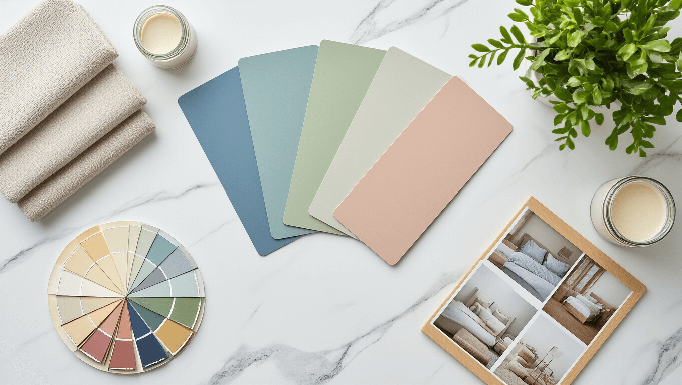
The Colors That Actually Help You Sleep (Not Just Look Pretty)
Soft Blues: The Undisputed Champion
Blue bedroom walls work because your brain associates them with calm skies and ocean waves.
I painted one bedroom in my home a dusty blue three years ago, and guests consistently tell me they sleep better in that room than anywhere else.
The best blue shades include:
- Powder blue (feels airy without being cold)
- Shadow blue (adds depth without darkness)
- Blue-gray (sophisticated and calming)
- Misty blue (perfect for small spaces)
Grab some blue paint samples and test them on different walls because lighting changes everything.

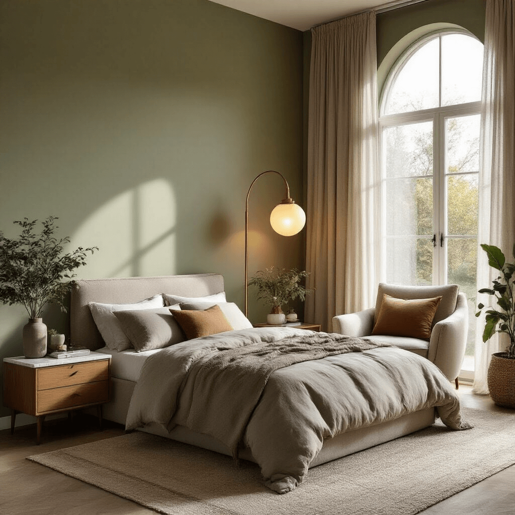
Greens That Don’t Scream “Hospital Waiting Room”
Green gets a bad rap because people remember those awful mint-green medical offices.
Done right, green brings the outdoors in without making your bedroom look like a garden center.
The winning green tones:
- Sage green (earthy and grounding)
- Mossy green (adds warmth)
- Seafoam (light and refreshing)
- Olive undertones (rich but not overwhelming)
I used a muted sage in my own bedroom, and the difference was immediate. The space felt instantly more restful. My morning anxiety dropped noticeably within the first week.
Neutrals That Aren’t Boring As Hell
Beige got trendy again, and thank goodness because neutrals done right create the most versatile sleep spaces.
The neutral palette that works:
- Warm taupe (luxe hotel vibes)
- Greige (gray meets beige, stops arguments)
- Soft ivory (classic without being stark)
- Mushroom (earthy and modern)
Use neutral paint colors as your base, and you’ll never regret it when you want to change your bedding or decor.
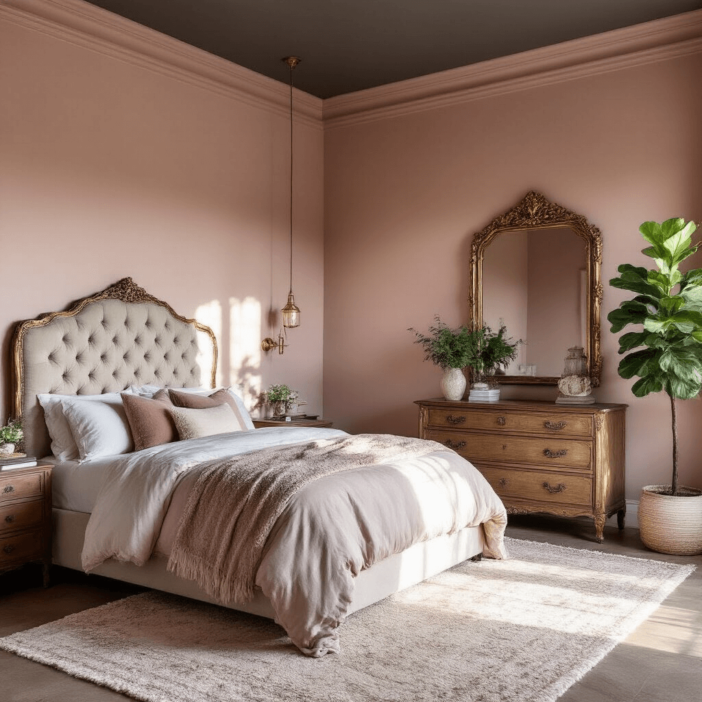
Soft Pinks (Yes, Really)
Before you skip this section, hear me out.
I’m not talking about Pepto-Bismol pink. The right dusty rose or blush creates warmth without the saccharine sweetness.
Pink shades that adults can live with:
- Dusty rose (sophisticated, not childish)
- Mauve (slightly purple undertones)
- Peachy pink (warm and inviting)
- Barely-there blush (subtle and elegant)
My guest bedroom is a muted mauve, and male guests have complimented it more than any other color I’ve used.
The Colors You Should Avoid (Unless You Enjoy Staring at the Ceiling at 3 AM)
Some colors are scientifically proven to mess with your sleep cycle.
Skip these unless you hate rest:
- Bright red (raises heart rate)
- Electric orange (stimulates appetite and energy)
- Neon yellow (basically drinking coffee with your eyes)
- Deep purple (can feel oppressive)
- Pure black (unless you’re a vampire)
I once stayed in an Airbnb with crimson walls. I got maybe four hours of sleep total over three nights. The host probably wondered why I left looking like a zombie.
How to Actually Choose Your Color (The Real Process)
Stop picking colors from tiny paint chips under fluorescent store lighting.
Here’s what actually works:
Step 1: Buy sample sizes of your top three choices
Get those paint sample pots and stop guessing.
Step 2: Paint large swatches on different walls
Colors look completely different depending on which direction your windows face.
Step 3: Live with the samples for at least five days
Check them in morning light, afternoon sun, and evening artificial light.
Step 4: Sleep in the room if possible before committing
Your emotional response matters more than what looks good on Pinterest.
Step 5: Consider your existing furniture and bedding
That gorgeous blue might clash horribly with your burgundy curtains.
The Lighting Factor Nobody Talks About
Natural light transforms colors throughout the day.
North-facing rooms stay cooler and darker, so they can handle warmer tones. South-facing rooms get intense light, making cool colors essential. East-facing bedrooms get gorgeous morning light but can look dull by evening. West-facing spaces glow at sunset but start dark in the morning.
I learned this after painting a west-facing bedroom a color that looked perfect at 4 PM but turned muddy and depressing every morning.
Invest in color temperature LED bulbs so you can adjust your lighting to complement your paint choice.
The Accent Wall Debate: When It Works (And When It’s a Disaster)
Accent walls can add personality without overwhelming your space.
When to do an accent wall:
- You want color but feel nervous about commitment
- Your room has interesting architectural features
- You’re working with a bold shade like navy or charcoal
- Behind your bed creates a natural focal point
When to skip it:
- Your room is small (it can make spaces feel chopped up)
- You have multiple doors and windows (nowhere logical to place it)
- You’re using subtle color differences (it’ll just look like a mistake)
My master bedroom has a deep charcoal accent wall behind the bed, while the other three walls are soft gray. It adds drama without making the whole room feel like a cave.
Using Bold Colors Without Ruining Everything
You love deep jewel tones but know they might kill your sleep quality.
Here’s how to get the best of both worlds:
Option 1: Go dark on the lower half
Paint wainscoting or a chair rail in your bold color, keep the upper walls light.
Option 2: Paint the ceiling
A dusty pink or soft blue ceiling adds interest while keeping walls neutral.
Option 3


