
This post may contain affiliate links. Please see my disclosure policy for details.
Three Colors That Go Together: My No-Nonsense Guide to Color Combinations That Actually Work
Contents
Three colors that go together can transform any space from “meh” to magnificent, but let me tell you—I’ve seen enough color disasters to know that picking the right trio isn’t as simple as closing your eyes and pointing at a paint deck.
You’re standing in the paint aisle, overwhelmed by thousands of chips. Your living room looks like a confused rainbow threw up. You want your home to feel pulled together, not like you let your toddler loose with crayons.
I get it, and I’m here to fix it.

Why Three Colors Is the Magic Number (And Not Just Random Design Nonsense)
Here’s the thing about three-color palettes: they’re the Goldilocks of interior design.
One color? Boring as watching paint dry (pun intended). Two colors? Can feel stark and unfinished. Three colors? Just right for creating depth without chaos.
The 60-30-10 rule changed my entire approach to decorating. 60% goes to your dominant color (usually walls). 30% to your secondary color (furniture and larger accents). 10% to your accent color (the fun stuff that makes people say “wow”).
When I first learned this, I immediately looked at my bedroom and realized why it felt off—I had equal amounts of everything, and the result was visual chaos that made my eyes tired.
The Foolproof Triadic Scheme: Bold But Never Boring
Triadic color combinations use three colors evenly spaced around the color wheel—think of an equilateral triangle.
Classic triadic combos that work every single time:
- Red, yellow, and blue (primary colors—yes, like kindergarten, but surprisingly sophisticated when done right)
- Orange, green, and purple (secondary colors that pack serious punch)
- Teal, coral, and golden yellow (my personal favorite for a modern, energetic vibe)
Last summer, I repainted my daughter’s playroom using a softened triadic scheme. We went with sage green walls, dusty coral curtains, and butter yellow accents through decorative throw pillows and a gorgeous area rug.
The result? Energetic without being overwhelming. Playful without looking like a circus.
Pro tip from my mistakes: Triadic schemes work best when you soften or mute at least one of the colors. Going full saturation on all three looks like a 1980s ski jacket exploded in your room.
Analogous Colors: When You Want Harmony Without Trying Too Hard
Analogous colors sit next to each other on the color wheel, and they’re basically best friends that never fight.
These combinations flow like butter:
- Blue, blue-green, and green (coastal vibes without the cliché seashells)
- Red, red-orange, and orange (warm and inviting, perfect for dining rooms)
- Yellow, yellow-green, and green (fresh and springy, makes kitchens sing)
- Purple, blue-purple, and blue (moody and sophisticated)
I used an analogous scheme in my home office last year. Deep navy walls as the base. Medium blue built-in shelving. Sky blue accents through desk accessories and a comfortable ergonomic chair.
The space feels cohesive and calm—exactly what I need when I’m staring at a screen for eight hours.
The catch? Analogous schemes can look flat if you don’t vary your values and saturation. Mix lights, mediums, and darks within your chosen color family.

Monochromatic Magic: Three Shades of Awesome
Monochromatic doesn’t mean monotonous—it means using three different values of the same color.
Think:
- Light gray + medium gray + charcoal (modern minimalist heaven)
- Pale blush + rose + deep burgundy (romantic without the Valentine’s Day overload)
- Cream + tan + chocolate brown (warm neutrals that feel expensive)
- Powder blue + sky blue + navy (crisp and classic)
My master bathroom is entirely monochromatic in shades of greige. Light greige walls. Medium greige bath towels and shower curtain. Dark greige floor tiles.
It looks like a spa, and guests constantly ask if I hired a designer. Nope—just understood that different shades of one color create automatic sophistication.
The secret sauce: Texture becomes your best friend in monochromatic schemes. Without color variation, you need textural interest through fabrics, finishes, and materials.

My Favorite “Can’t Mess This Up” Three-Color Combos
After decorating three houses and helping countless friends avoid color catastrophes, these are my ride-or-die combinations:
The Modern Neutral
- Warm white + soft gray + black accents
- Works everywhere, never looks dated
- Perfect if you’re indecisive or planning to sell soon
The Coastal Fresh
- White + navy + coral
- Beachy without the tourist trap aesthetic
- Makes spaces feel larger and brighter
The Earthy Bohemian
- Terracotta + sage green + cream
- Trendy but with staying power
- Pairs beautifully with natural wood and plants
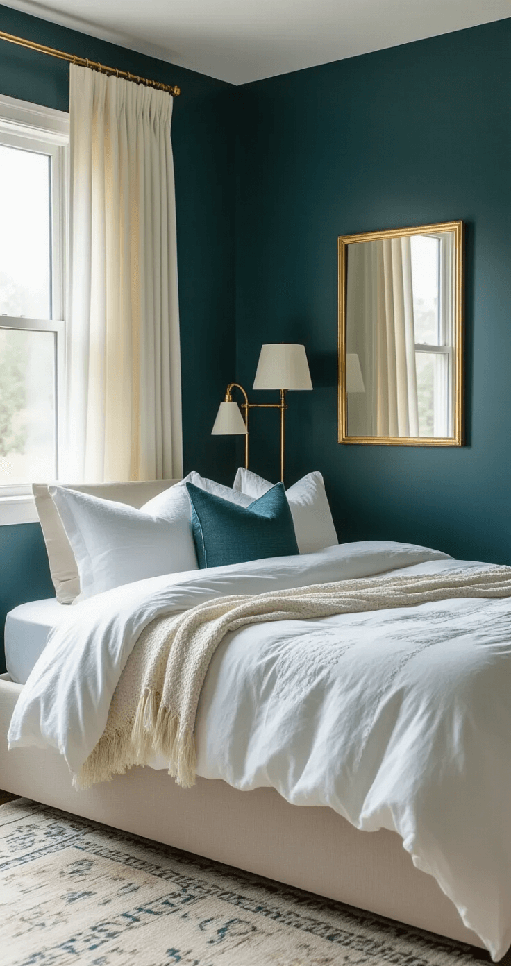
The Moody Sophisticated
- Charcoal + forest green + brass/gold accents
- Dramatic but livable
- Makes small spaces feel intentional instead of cramped


