This post may contain affiliate links. Please see my disclosure policy for details.
I’ve Been Watching 2024’s Interior Design Trends Unfold—And Here’s Everything That Actually Matters
Contents
Interior design trends for 2024 completely threw out the rulebook, and honestly? I’m here for it.
Gone are those sterile, cold spaces that felt more like hospital waiting rooms than homes. What rolled in was something far more interesting—spaces that actually breathe, materials you want to touch, and colors that make you feel something.
I spent the better part of this year watching these trends take over my social media feeds, showing up in client requests, and honestly transforming how we think about our living spaces. Let me break down what actually stuck and what’s worth your attention.

🌟 Steal This Look
- Paint Color: Sherwin-Williams Urbane Bronze SW 7048
- Furniture: curved boucle sofa in oatmeal or sand tone, rounded-edge oak coffee table with live edge detail
- Lighting: oversized organic ceramic pendant with hand-applied glaze, warm 2700K dimmable LED
- Materials: raw travertine, unlacquered brass, slubby linen, reclaimed white oak, hand-troweled plaster
There’s something deeply satisfying about walking into a room that doesn’t feel staged for a magazine—where the coffee table bears the soft patina of actual use and the light shifts beautifully through handmade ceramic. This is the year we stopped performing perfection and started living in our spaces again.
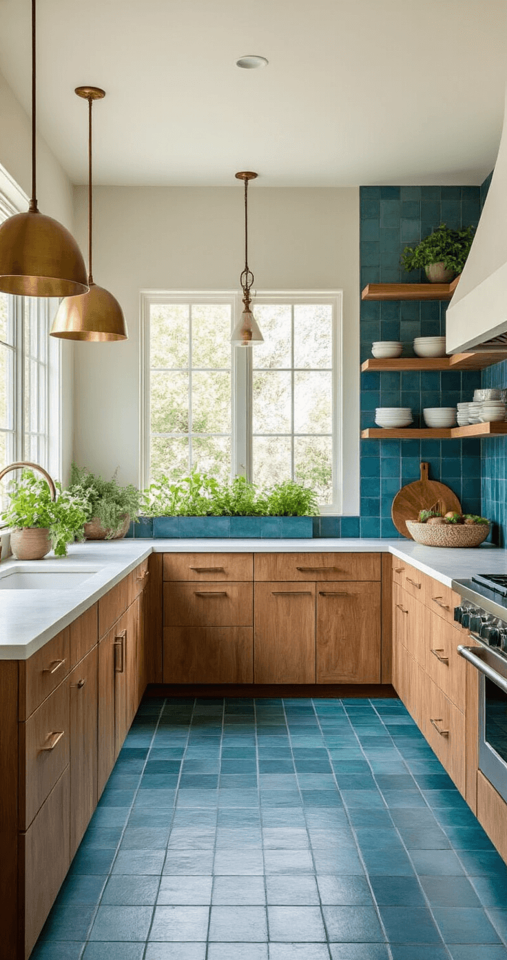
The Green Revolution Isn’t Just Talk Anymore
Biophilic design became the phrase everyone learned to pronounce this year. Basically, it means bringing nature inside, but not in that sad-single-succulent-on-your-desk way.
I’m talking proper integration:
- Living walls that turn entire sections into vertical gardens
- Natural materials everywhere—real wood, actual stone, not the laminate stuff
- Indoor plants that don’t just survive but actually thrive
- Natural light treated like the precious resource it is
The shift felt personal to me. After years of pushing chrome and glass, watching people prioritize large indoor planters and sustainable materials felt like coming home.
Sustainability stopped being a buzzword and became an actual requirement. People started asking where materials came from, how they were made, who made them.
✎ Steal This Look
- Paint Color: Benjamin Moore Forest Floor 1498
- Furniture: low-profile teak platform bed with live-edge headboard, woven rattan accent chair
- Lighting: oversized woven rattan pendant with dimmable LED, brass floor lamp with linen shade
- Materials: raw teak, handwoven rattan, unpolished limestone, organic cotton, terracotta
There’s something deeply restorative about waking up surrounded by living things—my own bedroom shifted from sterile sanctuary to something that actually breathes with me.
Colors That Make You Want to Actually Stay Home
Warm, Earthy Tones Dominated Everything
Beiges came back with a vengeance, but not your grandmother’s boring beige. We’re talking:
- Creamy whites with undertones that change throughout the day
- Olive greens that feel sophisticated, not army surplus
- Terracotta that brings Mediterranean warmth without the vacation price tag
- Rich browns that somehow feel luxurious instead of muddy
I watched browns specifically have this incredible renaissance. Aubergine, cherry, marigold, cocoa—these colors showed up in places I never expected.
Jewel Tones for People Who Actually Have Opinions
Moody blues took over accent walls everywhere. Navy and indigo paired with crisp whites created this dramatic tension that photographs beautifully but, more importantly, lives beautifully.
Soft greens became the quiet hero. Sage green particularly exploded, with Graham and Brown actually naming their version “Veridis” as their color of the year. I used it in three different spaces, and each time, clients literally sighed with relief when they walked in.
The Monochrome Crowd Got Their Moment Too
Not everyone wants color, and 2024 respected that. Warm monochromatic schemes using beiges, taupes, and soft browns created these incredibly cohesive spaces. Greyscale palettes worked when designers played with different finishes—matte here, gloss there, metallic accent pieces catching light in unexpected ways.
Accent Colors That Don’t Make You Cringe
Sunny yellows brightened spaces without screaming “look at me.” Pastels—blush pink, soft lavender, baby blue—offered whimsy without feeling childish.
🎨 Steal This Look
- Paint Color: Farrow & Ball Dead Salmon 28
- Furniture: curved boucle sofa in a warm oatmeal or camel tone, paired with a sculptural walnut coffee table with rounded edges
- Lighting: oversized linen drum pendant with brass hardware, dimmable to shift from task to ambient
- Materials: raw silk, unlacquered brass, hand-troweled plaster, and reclaimed European oak with visible grain
There’s something almost rebellious now about choosing colors that don’t perform for Instagram—colors that feel better at 6 p.m. with a glass of wine than they do in morning light, because that’s when you’re actually living in the room.
The Details That Actually Changed Everything
Statement Lighting Stopped Being Optional
Lighting became the jewelry of interior design this year. Not just fixtures, but entire lighting systems that adjust color temperature and intensity throughout the day.
High-tech smart lighting systems that simulate natural daylight became genuinely desirable, not just tech-nerd territory. I installed one in my own space, and the difference in how I feel at 6 AM versus 8 PM is genuinely remarkable.
Texture Replaced Shine
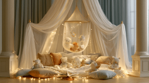
Velvet absolutely exploded. Velvet curtains, velvet throw pillows, velvet bedding—everywhere you looked, there it was. And unlike past velvet moments that felt stuffy or Victorian, this iteration felt modern and approachable.
Textured wall finishes replaced the high-gloss lacquer that dominated previous years. Matte, specialty finishes, walls that invited touch rather than prohibited it.
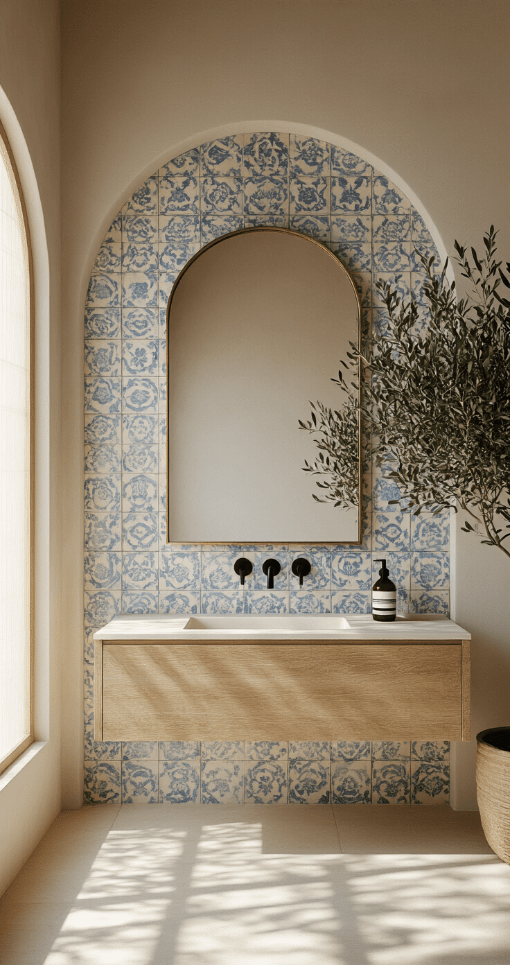
Tiles Made an Unexpected Comeback
Ceramic and terra-cotta tiles earned top positions this year. But not your standard subway tile—we’re talking oversized tiles with serious tactile quality. Handmade Zellige tiles with their irregular surfaces and unexpected layouts created focal points that felt artistic.
Terra-cotta especially broke free from its traditional boundaries. I saw it in entrance halls, as decorative accents, in colors ranging from natural ocher to beautiful greens and cobalt blues.
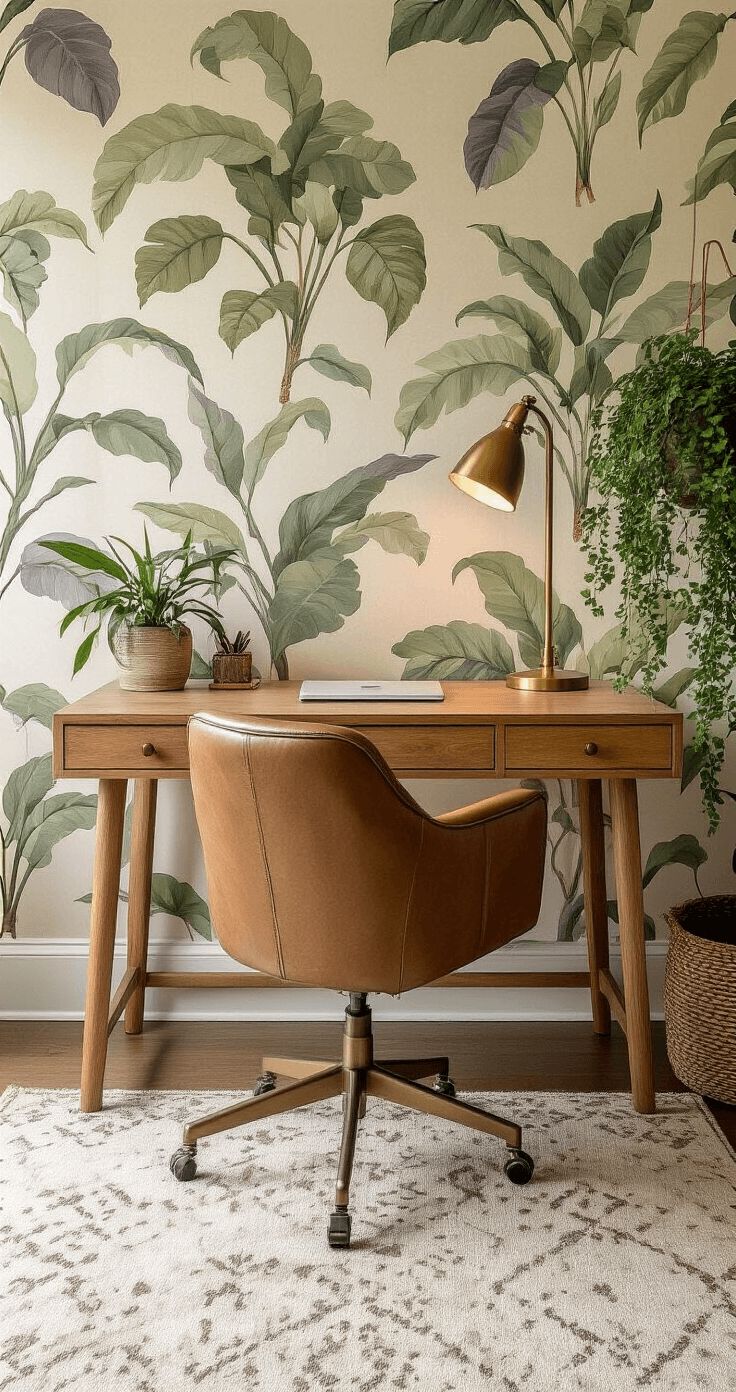
Wallpaper Escaped the Living Room
Wallpaper showed up in bathrooms, dining rooms, mudrooms, utility spaces—anywhere someone wanted personality. Bold patterns transformed ordinary spaces into something worth photographing. One client put botanical wallpaper in a powder room, and it became the most talked-about space in their entire house.
Curves Replaced Angles
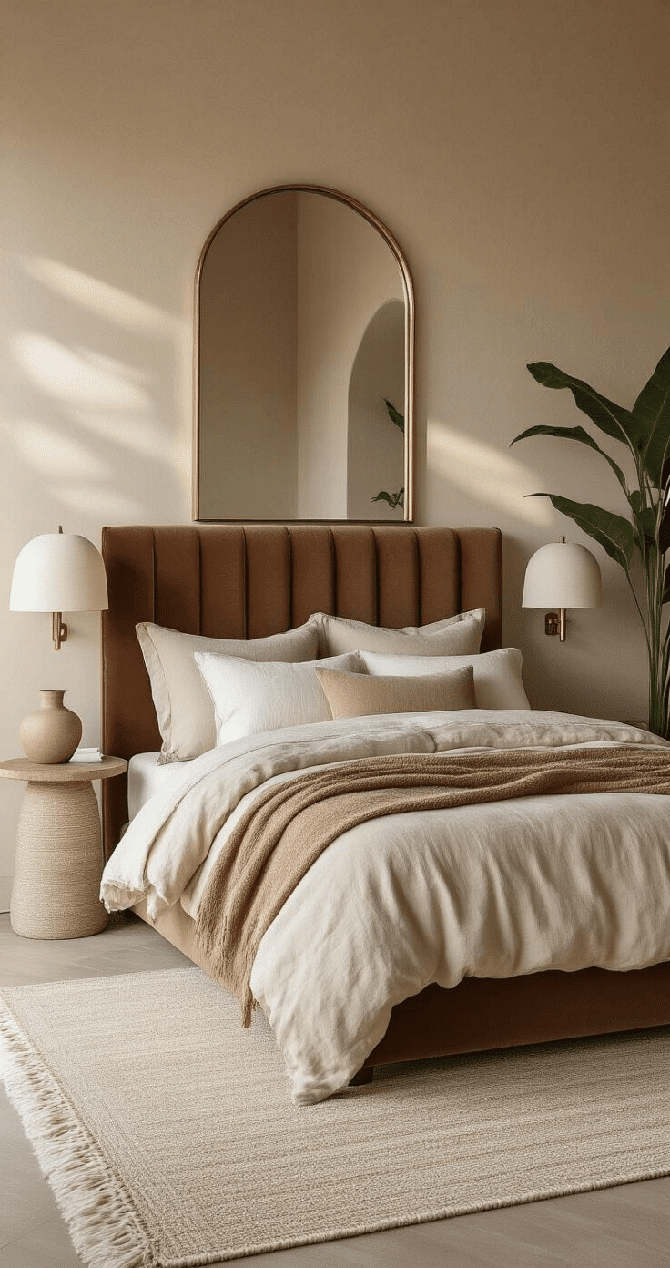
Arched mirrors, arched headboards, arched doorways—suddenly everything softened. The harsh angular lines that dominated minimalism gave way to organic, flowing silhouettes.

💡 Steal This Look
- Paint Color: Behr Cracked Pepper PPU18-01
- Furniture: low-profile velvet channel-tufted sofa in a deep moss or rust tone
- Lighting: oversized sculptural pendant with integrated smart dimming and tunable white LED
- Materials: matte limewash walls, raw silk velvet, unlacquered brass, hand-troweled plaster
I used to think statement lighting was for showrooms until I hung a single oversized plaster pendant in my own living room—now it’s the first thing every guest photographs.