This post may contain affiliate links. Please see my disclosure policy for details.
Blue and Orange Bedroom: A Vibrant Design Journey
Contents
Bold. Unexpected. Stunning. Blue and orange aren’t just colors—they’re a design statement that transforms ordinary bedrooms into extraordinary spaces.
Why Blue and Orange Work Magic
Let’s cut to the chase: this color combo is design dynamite. Here’s why:
Color Psychology Breakdown:
- Blue brings calm and tranquility
- Orange radiates energy and warmth
- Together, they create visual excitement without overwhelming your senses
Perfect for Every Personality
Whether you’re a minimalist dreamer or a bold adventurer, blue and orange adapt to YOUR style:
- Moody & Sophisticated: Navy + burnt orange
- Playful & Fresh: Teal + bright orange
- Soft & Subtle: Peach + light blue

✎ Steal This Look
- Paint Color: Benjamin Moore Hale Navy HC-154
- Furniture: low-profile platform bed with navy velvet upholstery and brass legs
- Lighting: arched brass floor lamp with linen drum shade
- Materials: matte velvet, burnished brass, raw linen, and warm walnut wood
There’s something deeply satisfying about walking into a bedroom that feels both energized and restful—this pairing gives you permission to wake up optimistic and wind down peacefully in the same four walls.
Design Strategies That Actually Work
Balanced Color Application
Pro Tip: Think of color like seasoning—a little goes a long way.
Recommended Color Ratios:
- 60% Neutral Base (whites, grays)
- 30% Dominant Color (blue)
- 10% Accent Color (orange)
Texture is Your Secret Weapon
Don’t just think color—think feeling:
- Velvet orange throw pillows
- Linen blue bedspread
- Textured wool rug with blue/orange geometric patterns

🖼 Steal This Look
- Paint Color: Farrow & Ball De Nimes 299
- Furniture: upholstered platform bed in warm ivory linen with simple, low-profile silhouette
- Lighting: brass swing-arm wall sconce with white linen shade on either side of bed
- Materials: matte painted walls, raw brass hardware, chunky knit wool, slubby linen, velvet accents
This is the room that finally made me believe color rules work—my first attempt went full circus tent because I ignored the 60-30-10 ratio, and sleeping in what felt like a sports team locker room taught me restraint fast.
Practical Styling Techniques
Easy Implementation Steps
- Start with neutral walls (white or light gray)
- Add blue bedding
- Layer orange accessories
- Incorporate metallic or wood elements for depth
Accessorizing Like a Pro
Must-Have Accessories:
- Throw pillows
- Area rugs
- Artwork
- Decorative vases
- Lamp shades

✎ Steal This Look
- Paint Color: use Behr brand. Match the ACTUAL wall color in the image. Format: Behr Swiss Coffee 12
- Furniture: upholstered platform bed in navy linen, mid-century walnut nightstand with tapered legs, woven rattan accent chair
- Lighting: brass adjustable wall sconce with linen shade, ceramic table lamp with terracotta base
- Materials: washed linen bedding, chunky knit wool throws, raw terracotta, aged brass, live-edge walnut, flat-weave cotton rugs
This layered approach lets you test the color pairing without commitment—swap a few pillows seasonally and the room transforms without repainting a single wall.
Common Rookie Mistakes to Avoid
Warning: These will destroy your design:
- Using 50/50 color split (creates visual chaos)
- Ignoring texture
- Forgetting neutral zones
- Mismatching shades randomly
Budget-Friendly Transformation Tips
💡 Smart Upgrades Under $200:
- Paint an accent wall
- New bedding set
- Throw pillows
- Area rug
- Wall art

🌟 Steal This Look
- Paint Color: use PPG brand. Match a warm terracotta orange accent wall. Format: PPG Burnt Orange PPG1196-7
- Furniture: upholstered platform bed frame in navy linen-look fabric with simple channel tufting
- Lighting: adjustable brass swing-arm wall sconce with white linen drum shade
- Materials: matte ceramic table lamps, woven cotton dhurrie rugs, velvet pillow covers, reclaimed wood floating shelves
This is the room where you prove color confidence doesn’t require a designer budget—I’ve seen renters transform their sleep space over a single weekend with nothing more than painter’s tape, a $45 duvet cover, and the courage to commit to that accent wall.
Photography & Styling Secrets
Capture Your Space Like a Pro
Lighting Magic:
- Natural daylight is KING
- Shoot early morning or late afternoon
- Use side angles to show depth
Composition Rules:
- Create a clear focal point
- Balance symmetry and asymmetry
- Layer textures strategically

🎨 Steal This Look
- Paint Color: use Dunn-Edwards brand. Match the ACTUAL wall color in the image. Format: Dunn-Edwards ColorName CODE
- Furniture: specific furniture for this room
- Lighting: specific lighting fixture
- Materials: key textures and materials
There’s something deeply satisfying about finally nailing that shot where your amber velvet pillows catch the last light against your slate walls—it’s the moment you realize your bedroom actually looks as good as it feels.
Final Thoughts
Blue and orange isn’t just a color choice—it’s a lifestyle. It says you’re confident, creative, and unafraid to make bold design moves.
Your Bedroom, Your Rules
Remember: Design guidelines are suggestions, not prison sentences. Experiment. Have fun. Make the space uniquely yours.
Now go transform that bedroom! 🎨🛏️

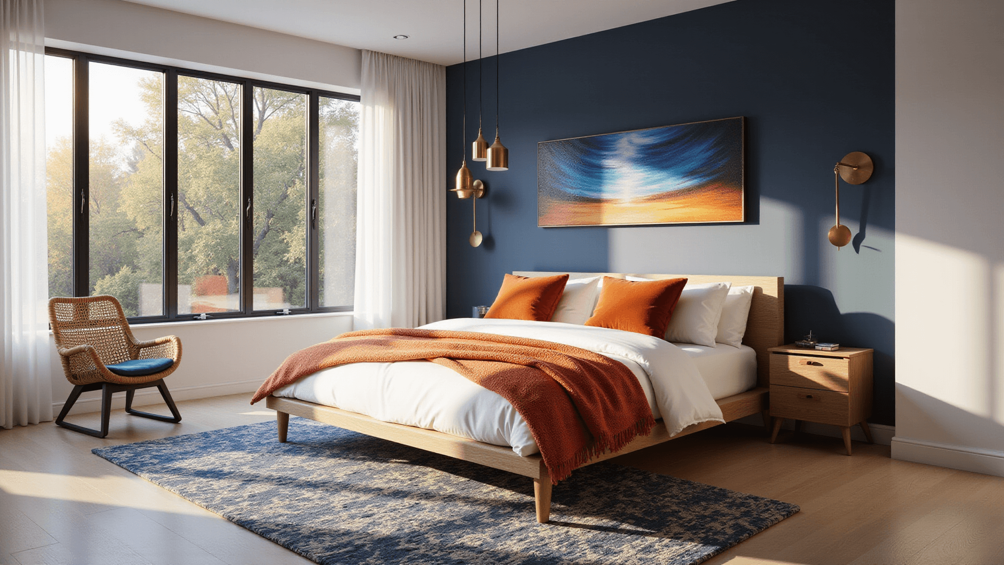
✎ Steal This Look
- Paint Color: use Clare Paint brand. Match a soft warm white that lets blue and orange accents pop. Format: Clare Paint Whipped CODE
- Furniture: low-profile platform bed in natural oak with clean lines to ground the bold color story
- Lighting: sculptural ceramic table lamp in terracotta finish for bedside warmth
- Materials: washed linen bedding, raw cotton throws, and burnished brass accents for lived-in sophistication
This is the room where you shed the day’s armor—making it bold means you’re giving yourself permission to wake up energized and fall asleep inspired, not apologetic.