This post may contain affiliate links. Please see my disclosure policy for details.
What Colors Go With White and Blue? Your Complete Guide to Perfect Pairings
Contents
- What Colors Go With White and Blue? Your Complete Guide to Perfect Pairings
- Why Your Blue and White Room Might Feel Incomplete
- The Warm Welcome: Adding Natural Tones
- The Soft Touch: Muted Colors That Play Nice
- The Bold Move: Accent Colors That Pack Punch
- Room-by-Room Color Strategies
- How to Actually Add These Colors (Without Screwing It Up)
White and blue create one of the most versatile color foundations you’ll ever work with, and I’m here to show you exactly which colors will take your space from “meh” to magnificent.
I’ve spent years watching people overthink this combination, staring at paint swatches until their eyes glaze over. Here’s the truth: blue and white are begging for company, and the right third (or fourth) color can completely transform your room’s personality.
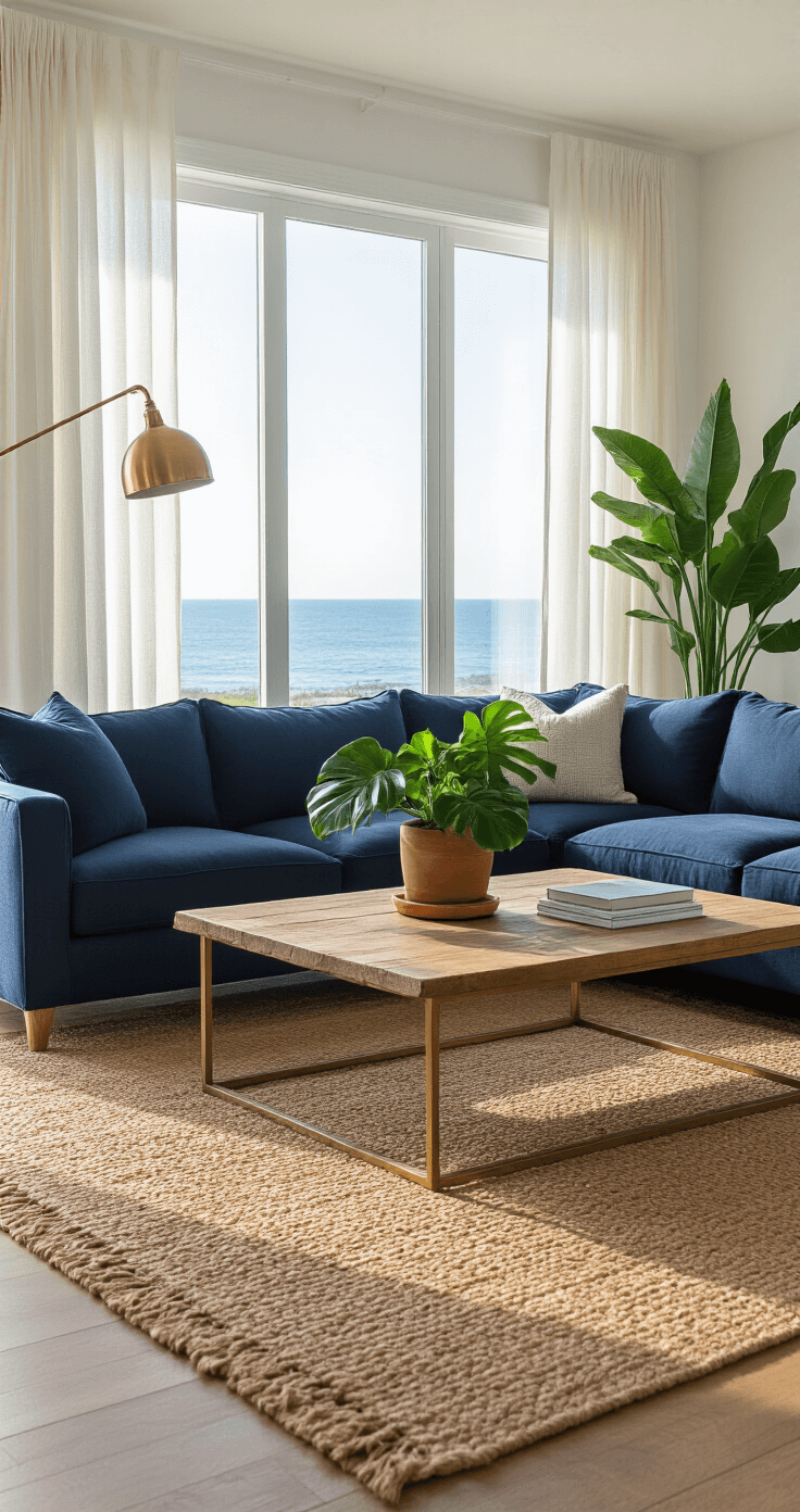
🏠 Steal This Look
- Paint Color: Sherwin-Williams Naval SW 6244
- Furniture: slipcovered white linen sofa with rolled arms
- Lighting: brass pharmacy floor lamp with adjustable arm
- Materials: weathered oak, natural jute, matte ceramic, aged brass
I’ve styled dozens of living rooms around this palette, and the moment clients see how a warm wood tone or metallic accent unlocks the whole scheme, the anxiety melts away—it’s genuinely satisfying to watch.
Why Your Blue and White Room Might Feel Incomplete
You’ve painted the walls. You’ve bought the furniture. But something’s off.
The room feels cold, maybe a bit too clinical, or just plain boring. I get it—I’ve been there, standing in my living room wondering why it looked more like a dentist’s waiting room than the coastal retreat I’d imagined.
The problem isn’t the blue and white. The problem is they need supporting actors to truly shine.
The Warm Welcome: Adding Natural Tones
Let me start with the easiest fix that works every single time.
Bringing in warm, organic elements instantly softens the cool crispness of blue and white:
- Tan and beige – Think woven baskets stacked in the corner or a jute area rug under your coffee table
- Warm wood tones – Oak, walnut, or honey-colored furniture adds richness without fighting for attention
- Terracotta – Clay pots with greenery create visual warmth and break up all that coolness
- Cream and ivory – Softer than stark white, these shades add dimension
I transformed my own bedroom by simply adding a chunky knit throw blanket in oatmeal and swapping cold white lampshades for linen ones. The space went from feeling like an icebox to a sanctuary in about fifteen minutes.
Pro tip: Leather in caramel or cognac tones works beautifully against navy blues and crisp whites.
★ Steal This Look
- Paint Color: Farrow & Ball Jitney No. 293
- Furniture: chunky oak coffee table with visible grain and rounded edges
- Lighting: oversized linen drum pendant with brass hardware
- Materials: raw jute, slubby linen, unbleached cotton, light oak, terracotta clay
This is the room where you’ll actually live—morning coffee, evening conversations—so those natural tones aren’t just pretty, they’re permission to relax without worrying about every spill and scuff.
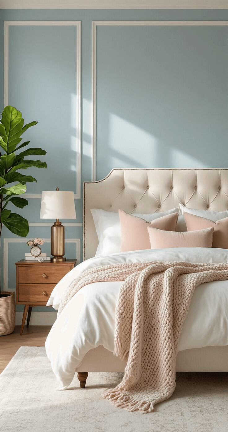
The Soft Touch: Muted Colors That Play Nice
Want to add more color without creating visual chaos? Reach for muted, powdery tones.
These colors have enough grey or white mixed in to harmonize rather than clash:
- Soft grey – The ultimate mediator between warm and cool
- Dusty rose or blush pink – Adds feminine softness without going full-on bubblegum
- Sage green – Brings the outdoors in while maintaining a calm vibe
- Powder blue – Deepens your blue palette with tonal variation
- Lavender – Unexpected but gorgeous with navy and white
I once helped a friend who insisted her blue and white guest room felt “too masculine.” We added blush pink velvet pillows and a dusty rose throw. Suddenly, the room had dimension and warmth without losing its sophisticated edge.
🖼 Steal This Look
- Paint Color: Behr Silver Ash N520-1
- Furniture: blush pink velvet settee with curved arms
- Lighting: matte brass table lamp with linen drum shade
- Materials: powder-coated metal, washed linen, unpolished marble, raw silk
Guest rooms often get the design leftovers, but this is exactly where muted accents shine—they make visitors feel intentionally welcomed rather than parked in a spare space.
The Bold Move: Accent Colors That Pack Punch
Feeling braver? These colors create drama and personality.
- Yellow and gold – Think sunshine breaking through clouds. Mustard yellow or golden brass fixtures add energy and prevent your blue-white space from feeling sleepy. Even small touches like yellow-spined books or a gold-framed mirror make an impact.
- Coral and peachy tones – These warm oranges complement blue on the color wheel while adding unexpected zing. Perfect for throw pillows, artwork, or a statement chair.
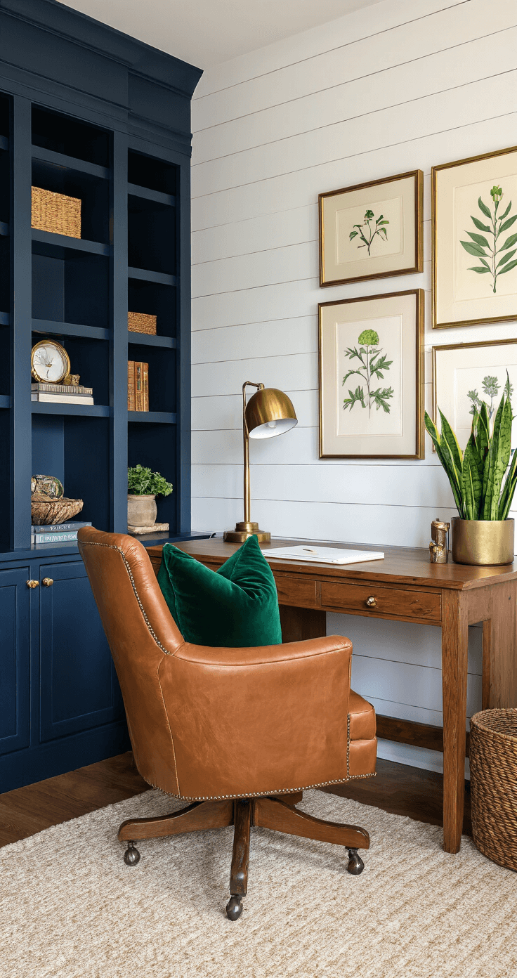
- Deep navy or indigo – Going darker with your blue creates stunning contrast against white. This is my go-to for making architectural features pop—paint your trim or an accent wall in deep navy, keep walls white, and watch the space transform.
- Emerald green – Rich, jewel-toned greens create a luxe, traditional feel. Pair with brass accents and you’ve got yourself a sophisticated library aesthetic.
- Bright white – Wait, hear me out. If you’re working with softer blues, introducing crisp, pure white creates sharp contrast that makes both colors look more intentional.
🌟 Steal This Look
- Paint Color: use Valspar brand. Match the ACTUAL wall color in the image. Format: Valspar ColorName CODE
- Furniture: mustard yellow velvet accent chair with tapered wooden legs
- Lighting: brass sputnik chandelier with exposed bulbs
- Materials: matte brass, textured velvet, raw linen, weathered oak, terrazzo
This is where I see homeowners hesitate most—yet every client who commits to one brave accent color tells me it became their favorite room to actually live in.
Room-by-Room Color Strategies
Living Room: Layer in warm wood furniture, add grey or tan upholstery, and punch it up with gold or brass in your lighting fixtures and hardware. A large indoor plant in a terracotta pot ties everything together.
Bedroom: Keep it serene with soft greys, blush pinks, and creams. Add warmth through wood nightstands and textured throws. This isn’t the room for bold accents unless you’re trying to avoid sleep.
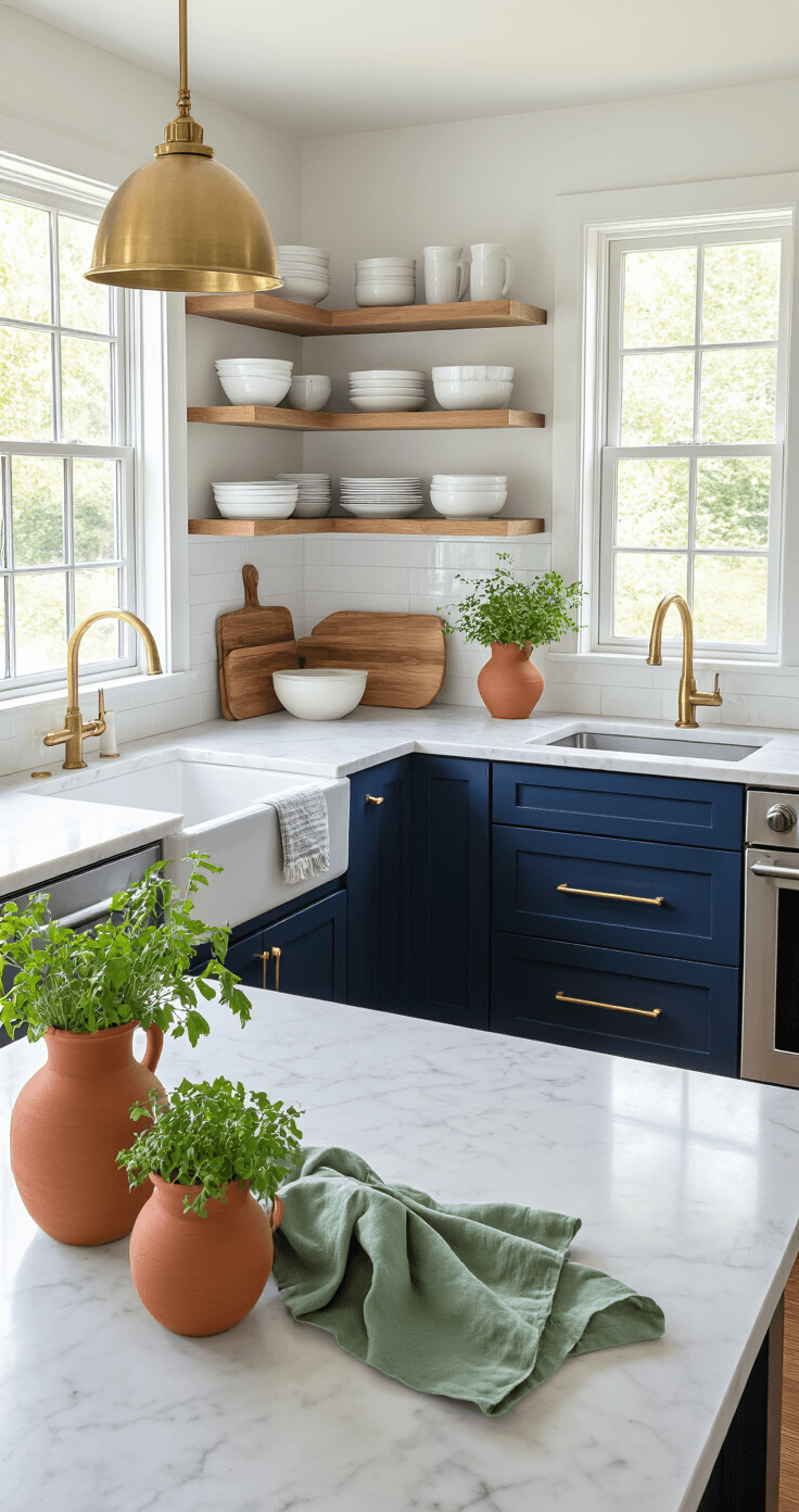
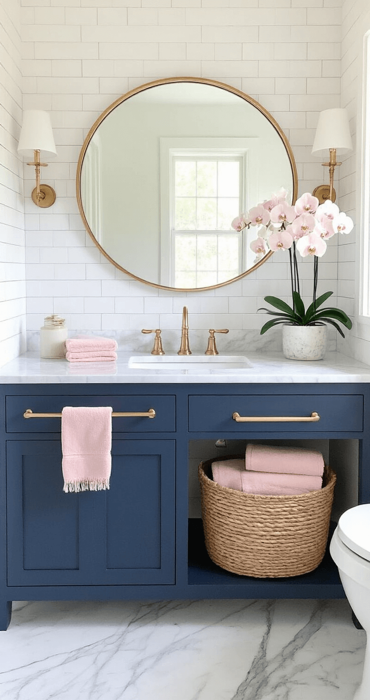
Kitchen: Navy cabinets with white countertops look stunning with warm brass hardware, wood cutting boards, and pops of terracotta in your pottery or dish towels.
Bathroom: Stick with coastal vibes using sandy beiges, driftwood greys, and touches of seafoam green. Chrome fixtures keep things crisp.
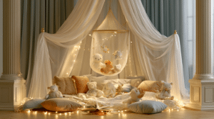
Kids’ Room: You can get playful here—add yellows, corals, or even touches of red. The blue and white foundation keeps chaos from taking over.
🏠 Steal This Look
- Paint Color: use PPG brand. Match the ACTUAL wall color in the image. Format: PPG ColorName CODE
- Furniture: specific furniture for this room
- Lighting: specific lighting fixture
- Materials: key textures and materials
1-2 sentences of human framing about this room
🎁 Get The Look
How to Actually Add These Colors (Without Screwing It Up)
Start small. I can’t stress this enough.
Buy decorative throw pillows in your test color before committing to a new sofa. Grab artwork or a small rug. Live with it for a week.
Follow the 60