
This post may contain affiliate links. Please see my disclosure policy for details.
Why Your White and Grey Room Feels Flat (And How To Fix It)
Contents
White and grey create the perfect neutral canvas. But canvas alone doesn’t make art.
These colors are workhorses, not show ponies. They need teammates to shine.
Think of them like the rhythm section in a band—essential, but they need that lead guitar to really get people moving.

The Colors That Actually Work (Not Just Theory)
Red and Grey: The Power Move
I once walked into a friend’s apartment and gasped. She’d paired charcoal grey walls with deep red throw pillows and a crimson area rug.
Dramatic? Yes. Gorgeous? Absolutely.
Here’s how to pull it off:
- Use white as your breathing room
- Layer light and dark greys to prevent visual chaos
- Add red through accessories first (pillows, artwork, vases)
- Keep red to about 20% of your color scheme
The grey tames red’s intensity while the red prevents grey from feeling cold. It’s like adding hot sauce to comfort food—suddenly everything’s interesting.
Mustard Yellow and Grey: The Unexpected Winner
I renovated my home office last year with mustard accents. Everyone said I was crazy. Everyone was wrong.
Mustard yellow transforms grey from corporate to cozy. The combination feels expensive without the price tag.
Why it works:
- Mustard brings warmth without screaming for attention
- Dark greys or greige (grey-beige) look phenomenal with golden tones
- Perfect for spaces that lack natural light
- Creates that “how much did your interior designer cost” vibe
Try mustard yellow curtains against pale grey walls. You can thank me later.
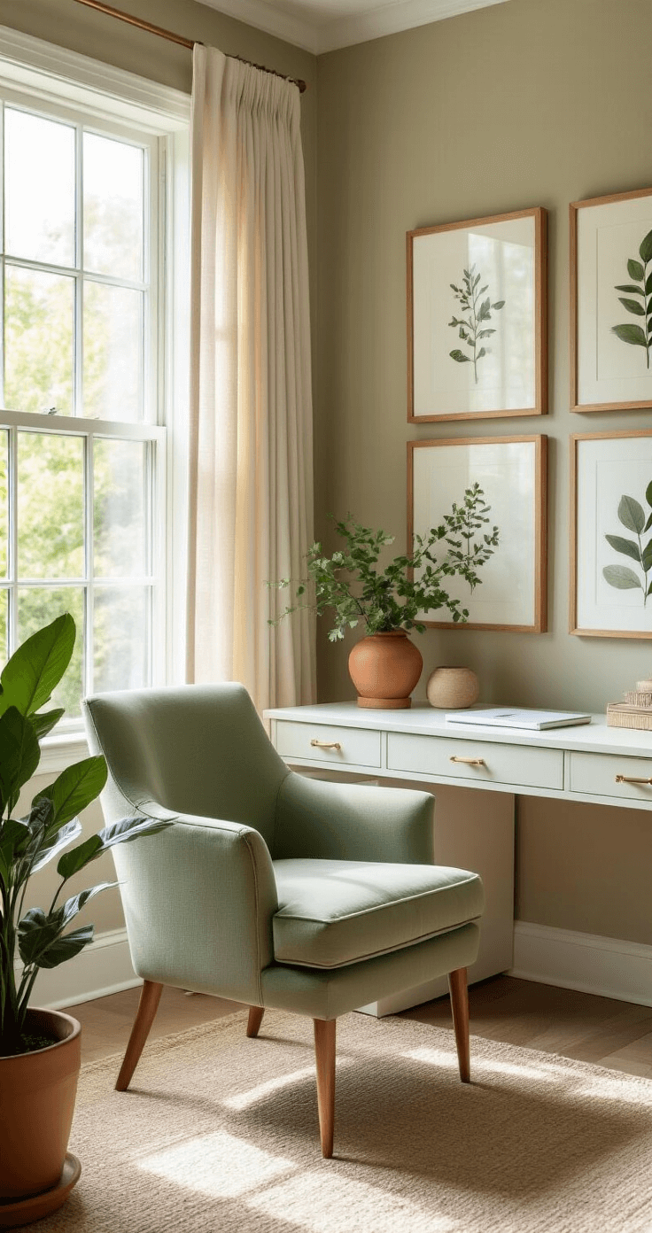
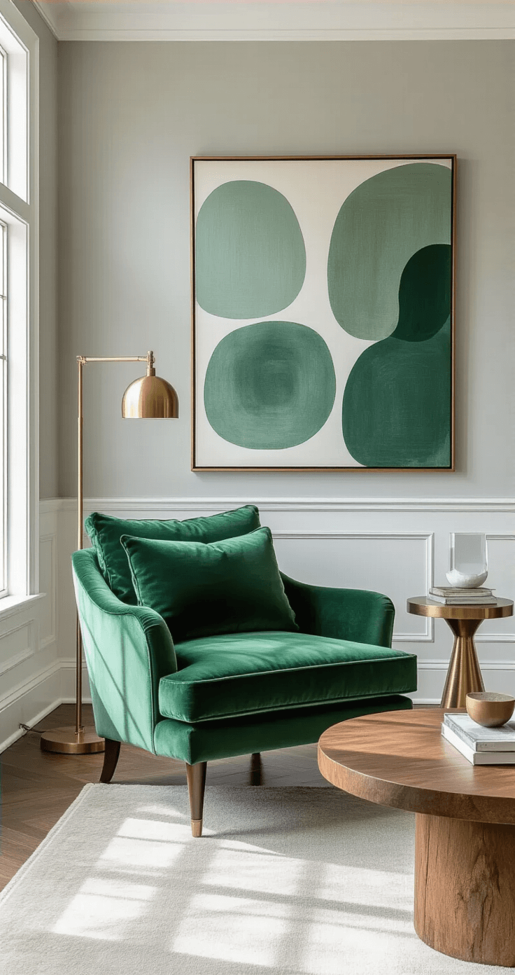
Green and Grey: Nature’s BFFs
Walk outside. Notice how grey rocks sit next to green plants? Mother Nature already solved this puzzle.
I added a large indoor plant and sage green accent chair to my grey living room. The space went from sterile to sanctuary overnight.
Green-grey pairing rules:
- Deep jewel-tone greens love abundant natural light
- Sage and olive greens work in dimmer spaces
- Use white to brighten and balance darker combinations
- Botanical prints tie everything together beautifully
The psychological effect is real—this combo actually reduces stress. Science backs it up, but honestly, you’ll feel it the moment you walk in.
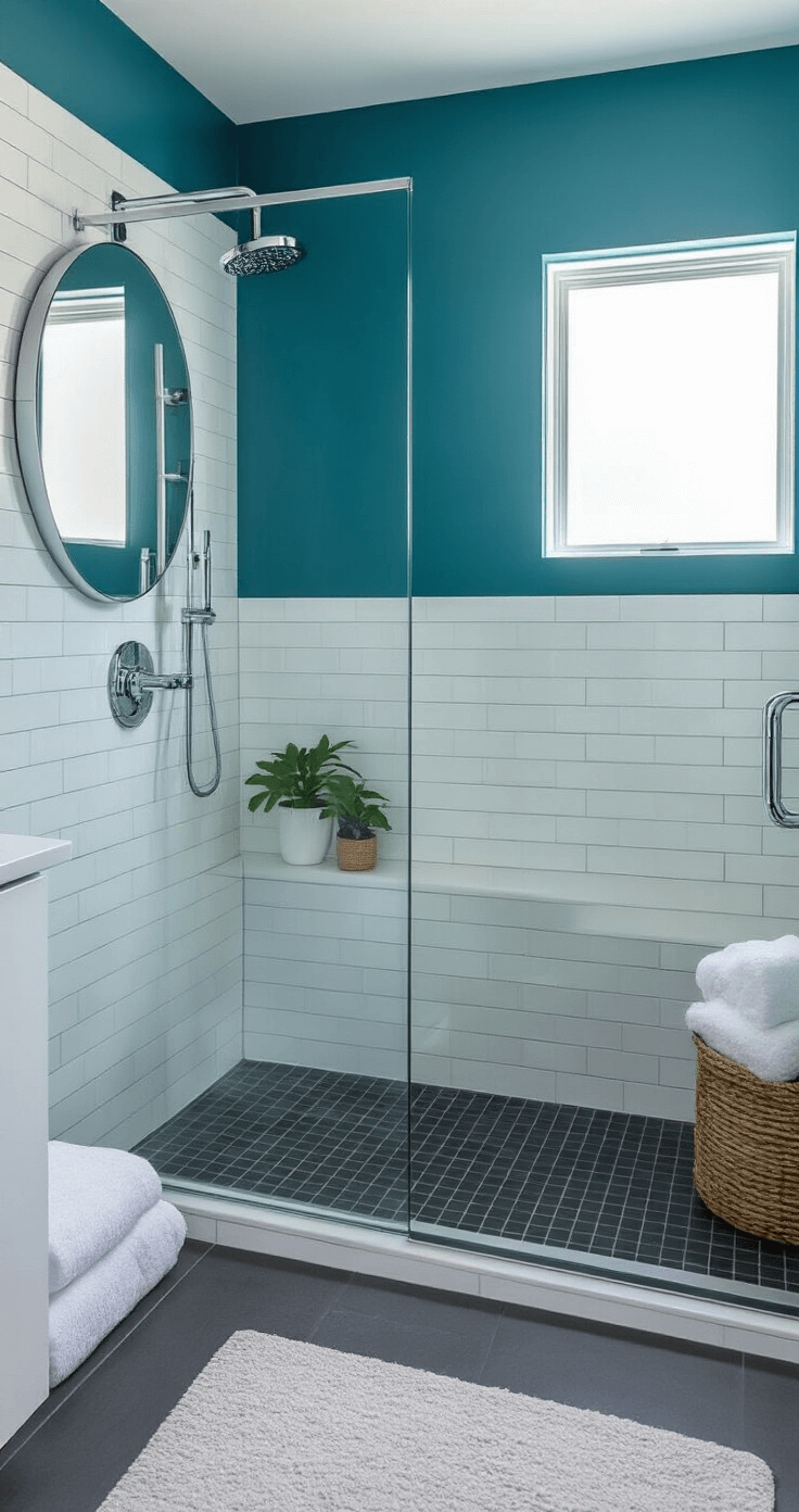
Teal Blue and Grey: The Sophisticated Choice
My bathroom makeover featured teal and grey. Guests literally ask where I got my “spa treatment” done. It’s paint and towels, people.
Two ways to approach teal-grey:
Option 1: Fresh and Modern
- Bright teal + pale grey
- Lots of white accents
- Chrome or brushed nickel fixtures
- Clean lines everywhere
Option 2: Rich and Moody
- Deep teal + charcoal grey
- Gold or brass accents
- Velvet textures
- Dramatic lighting
Both work beautifully. Your personality decides which one.
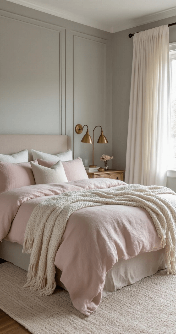
Blush Pink and Grey: Not Just For Baby Rooms
I resisted pink for years because I’m not twelve. Then I saw a bedroom with blush pink bedding against soft grey walls.
Game changer.
The secret sauce:
- Use muted, dusty pinks (not bubble gum)
- Keep whites crisp and bright
- Add grey in medium tones
- Incorporate natural wood tones
- Layer textures like linen and wool
This combination feels romantic without being saccharine. Elegant without trying too hard.
My guest bedroom now has blush pink bedding and nobody complains about the color. They complain about having to leave.
Blue and Grey: The Classic That Never Fails
Blue and grey together remind us of coastal mornings. There’s a reason beach houses use this palette—it works.
I’ve used this combination in three different rooms:
- Powder blue + light grey (nursery)
- Navy + charcoal grey (office)
- Sky blue + warm grey (bedroom)
All three feel completely different but equally successful.
Why this pairing is foolproof:
- Our brains associate these colors with nature (sky, water, stones)
- The combination feels inherently calming
- Works in any room, any style
- Easy to find accessories and furniture
Start with navy blue throw blankets if you’re nervous. You can build from there.
My Tried-and-True Method For Testing Colors
I’ve wasted money on wrong paint choices. Here’s how I avoid that now:
The 24-Hour Color Test:


