This post may contain affiliate links. Please see my disclosure policy for details.
Neutral Bedroom Ideas: Your Ultimate Guide to Serene, Stylish Spaces
Contents
- Neutral Bedroom Ideas: Your Ultimate Guide to Serene, Stylish Spaces
- Why Neutral Bedrooms Work Like Magic
- Texture: The Secret Weapon of Neutral Rooms
- Styling Tricks for Maximum Impact
- Style Variations: Neutral Works Everywhere
- Seasonal Refresh: Keep It Interesting
- Common Mistakes to Avoid
- Your Neutral Bedroom Checklist
- Final Thoughts
Imagine walking into a bedroom that instantly makes you breathe a little deeper. A space that feels like a warm hug, yet looks effortlessly sophisticated. That’s the magic of a well-designed neutral bedroom.

🏠 Steal This Look
- Paint Color: Sherwin-Williams Accessible Beige SW 7036
- Furniture: upholstered platform bed in oatmeal linen with rounded corners, paired with a weathered oak dresser and matching nightstands
- Lighting: oversized linen drum pendant with brass hardware, plus adjustable brass wall sconces flanking the bed
- Materials: raw Belgian linen, unbleached cotton, bleached oak, hand-thrown ceramic, and undyed wool in chunky weaves
I’ve slept in countless styled bedrooms, and the ones that actually help me unwind always share this quality: they feel lived-in, not staged, with textures that beg to be touched.
Why Neutral Bedrooms Work Like Magic
Let’s be real. Your bedroom isn’t just a room. It’s your personal sanctuary, your escape from the world’s chaos. A neutral palette isn’t boring—it’s strategic design that creates calm without sacrificing style.
Choosing Your Neutral Palette: More Than Just White Walls
Neutrals are like the cool kids of interior design. They’re not one-dimensional. Think:
- Soft ivory that whispers warmth
- Sophisticated taupe with depth
- Creamy beiges that feel like a gentle embrace
- Subtle greys that add understated elegance
Pro Tip: Don’t just pick one neutral. Layer them. Mix textures. Create depth.

✎ Steal This Look
- Paint Color: Benjamin Moore White Dove OC-17
- Furniture: upholstered platform bed in natural linen with clean lines and minimal visible frame
- Lighting: oversized linen drum pendant with brass hardware for soft ambient glow
- Materials: raw Belgian linen, unbleached cotton, light oak, brushed brass, handwoven jute
This is the bedroom you crawl into after brutal days, where nothing demands your attention and everything invites your exhale.
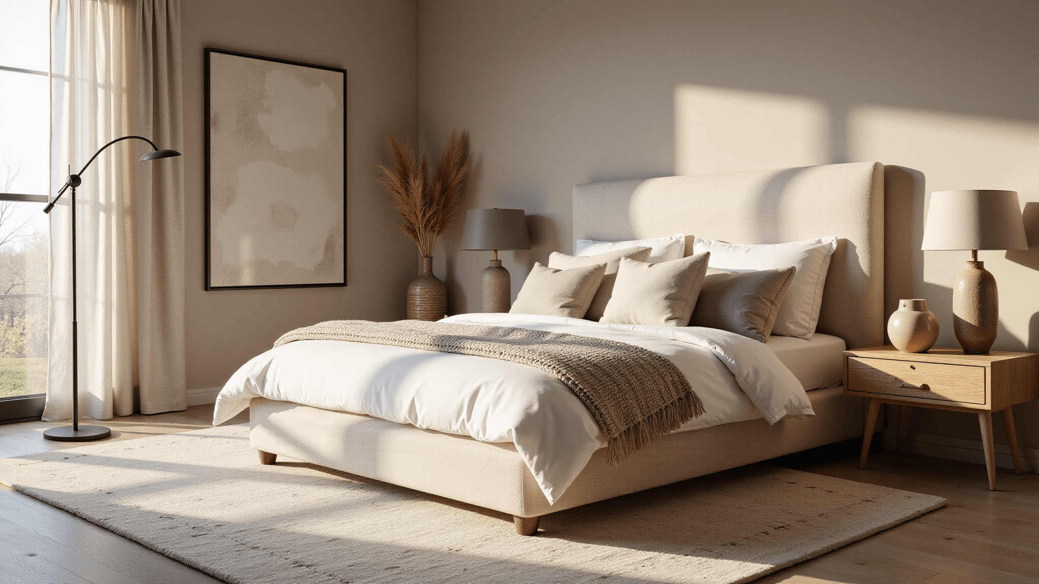
Texture: The Secret Weapon of Neutral Rooms
Neutrals come alive through texture. Imagine:
- Chunky knit throws
- Linen sheets with subtle wrinkles
- Wool rugs with hand-woven character
- Silk pillows that catch the light
Material Magic: Wood, Metal, and Natural Fibers
Combine:
- Weathered oak furniture
- Brass lamp fixtures
- Woven baskets
- Ceramic vases
These elements transform a neutral room from “meh” to “magnificent”.

🖼 Steal This Look
- Paint Color: Farrow & Ball Skimming Stone 241
- Furniture: Restoration Hardware Cloud Bed in Belgian Linen, weathered oak nightstands with live-edge detail
- Lighting: Visual Comfort E.F. Chapman Grosvenor House Table Lamp in hand-rubbed antique brass with natural linen shade
- Materials: Belgian flax linen bedding, chunky hand-knit merino wool throws, hand-woven jute and wool area rug, unglazed ceramic vessels, raw silk accent pillows
I’ve found that clients are often surprised by how much texture matters in neutral spaces—it’s the difference between a room that feels like a hotel catalog and one that feels like a sanctuary you never want to leave.
Styling Tricks for Maximum Impact
Bedding: Your Canvas of Comfort
- Start with crisp white sheets
- Add a taupe duvet
- Layer with cream and beige throw pillows
- Throw in a chunky knit blanket
Lighting: The Mood Maker
Warm, soft lighting is everything:
- Woven pendant lights
- Dimmable bedside lamps
- Natural light with sheer curtains

✎ Steal This Look
- Paint Color: Behr Swiss Coffee 12
- Furniture: low-profile upholstered platform bed in oatmeal linen, floating nightstands in light oak
- Lighting: oversized woven rattan pendant with Edison bulb, pair of ceramic table lamps with linen shades on dimmers
- Materials: Belgian linen bedding, chunky merino wool throw, raw silk curtains, unbleached cotton, light oak wood
This is the bedroom you crawl into after a long Tuesday when you need the world to feel quieter—the layers aren’t just pretty, they’re permission to actually rest.
Style Variations: Neutral Works Everywhere
Modern Minimalist
- Clean lines
- Matte finishes
- Minimal decor
Boho Neutral
- Macrame wall hangings
- Woven textures
- Organic shapes
Coastal Calm
- Sand-inspired tones
- Driftwood elements
- Breezy fabrics

🌟 Steal This Look
- Paint Color: use Valspar brand. Match the ACTUAL wall color in the image. Format: Valspar ColorName CODE
- Furniture: specific furniture for this room
- Lighting: specific lighting fixture
- Materials: key textures and materials
This is the bedroom style that finally convinced my color-obsessed sister to embrace neutrals—she realized she could still express her personality through texture and silhouette rather than relying on bold hues.
🔔 Get The Look
Seasonal Refresh: Keep It Interesting
Quick Swap Ideas:
- Summer: Light linens, fewer layers
- Winter: Chunky knits, rich textures
- Add seasonal branches or minimal greenery
Common Mistakes to Avoid
❌ Don’t: Use only bright white
✅ Do: Create depth with varied neutral tones
❌ Don’t: Overcrowd the space
✅ Do: Embrace minimalism
Your Neutral Bedroom Checklist
- [ ] Layered neutral tones
- [ ] Mixed textures
- [ ] Warm lighting
- [ ] Minimal, purposeful decor
- [ ] Personal touches
Final Thoughts
A neutral bedroom isn’t about being safe. It’s about creating a canvas that reflects tranquility, sophistication, and your unique style.
Your bedroom should tell your story—softly, elegantly, neutrally.