This post may contain affiliate links. Please see my disclosure policy for details.
Why Color Matters: The Front Door First Impression
Contents
When I first moved into my brick home, I realized something crucial: the front door isn’t just an entry point—it’s a statement. The right color can:
- Boost curb appeal
- Increase home value
- Reflect your personal style
- Create visual harmony with brick tones

✎ Steal This Look
- Paint Color: Sherwin-Williams Tricorn Black SW 6258
- Furniture: a slim black metal console table with a marble top for the foyer just inside
- Lighting: a brass and seeded glass outdoor wall lantern flanking the door
- Materials: worn brick, matte black metal, antique brass hardware, natural linen, and weathered wood
I learned this the hard way after painting my first door a sage green that looked stunning in the store but clashed horribly with my brick’s rusty undertones—now I always live with large swatches for a full week.
🔔 Get The Look
Top 14 Front Door Colors That Slay with Brick Homes
1. Classic Black: The Timeless Showstopper
Matte black door hardware + deep black paint = instant sophistication. Perfect for creating dramatic contrast against any brick tone.

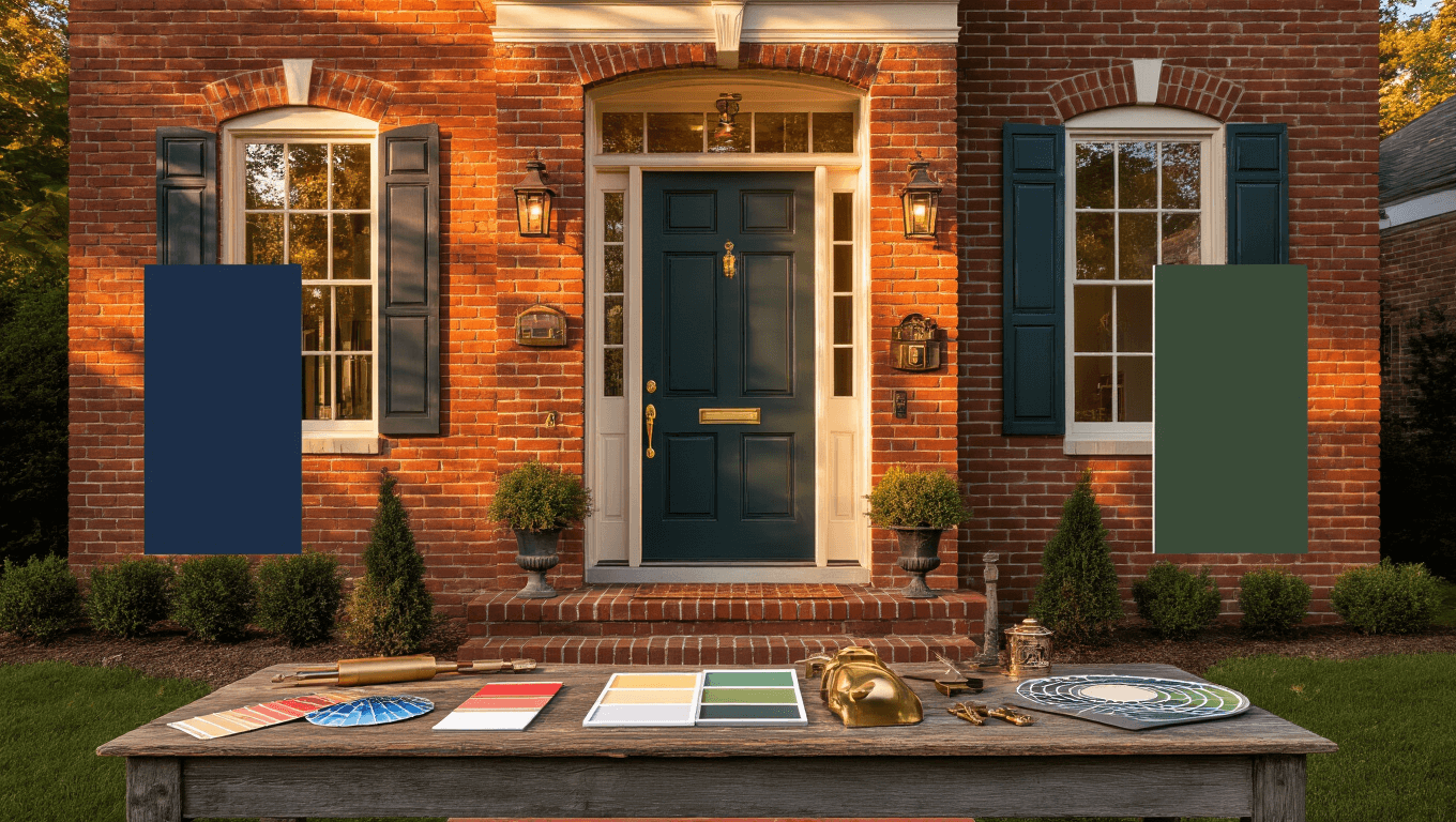
Hale Navy screams “refined” without trying too hard. Especially killer with orange-red brick backgrounds.
3. Deep Green: Nature’s Embrace
Hunter green or forest green paint brings an organic, luxe feel that whispers “designer home.”

4. Warm Wood Tones: Natural Sophistication
A mahogany wood stain connects your home to its earthy roots. Timeless and always classy.
5. Burgundy: Bold and Inviting
Deep red says, “Welcome home” with confidence. Works magic on both traditional and modern brick styles.

Pro Design Tips for Choosing Your Perfect Color
- Test Before Committing: Paint large swatches and observe in different lighting
- Consider Home’s Architecture: Mid-century? Victorian? Choose accordingly
- Think About Surrounding Landscape: Your color should complement, not compete

💡 Steal This Look
- Paint Color: Benjamin Moore Hale Navy HC-154
- Furniture: teak Adirondack rocking chair with navy Sunbrella cushion
- Lighting: brass nautical bulkhead sconce with frosted glass shade
- Materials: natural jute doormat, aged brass door knocker, limewashed terracotta planters
There’s something deeply satisfying about pulling into your driveway and seeing a door that feels like it was chosen just for your home, not pulled from a generic builder palette.
Unexpected Color Gems
- Galapagos Turquoise: For the brave design rebels
- Wasabi Green: Modern, unexpected, conversation-starting
- Slate Gray: Sleek, contemporary, always impressive

💡 Steal This Look
- Paint Color: Farrow & Ball Vardo 288
- Furniture: Sculptural teak entry bench with hidden storage
- Lighting: Matte black oversized dome pendant with brass interior
- Materials: Hand-glazed ceramic tile, raw concrete, oxidized copper, woven jute
There’s something deeply satisfying about watching neighbors slow down to stare at a door that dares to be different—these are the homes people remember and talk about for years.
Frequently Asked Color Questions
Q: How do I know if a color will work with my brick?
A: Sample, sample, sample! Use large paint sample boards and view them at different times of day.
Q: Can I mix brick and door colors?
A: Absolutely! Use color wheels and undertone matching to create harmony.

✎ Steal This Look
- Paint Color: Behr Blank Canvas DC-003
- Furniture: weathered teak console table with iron legs
- Lighting: oversized matte black barn sconce with seeded glass
- Materials: raw brick, aged brass, hand-thrown ceramic, natural linen
I learned this the hard way after falling in love with a sage green that turned muddy against my orange-toned brick at sunset—now I never commit without a 24-hour sample test.
Final Color Wisdom
Remember: Your front door is your home’s handshake. Make it firm, confident, and memorable.
Color Selection Checklist
- ✅ Complements brick undertones
- ✅ Reflects home’s architectural style
- ✅ Makes you smile every time you see it
- ✅ Feels authentically “you”
Exterior paint brush set recommended for perfect application!
Your Turn
Which color speaks to your home’s soul? Drop a comment and share your front door transformation journey!