This post may contain affiliate links. Please see my disclosure policy for details.
Why Color Matters in Your Bedroom
Contents
Your bedroom isn’t just a room. It’s your personal retreat, a space where you begin and end each day. The right color can:
- Boost your mood
- Enhance relaxation
- Reflect your personality
- Create visual harmony
- Improve sleep quality

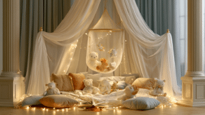
🌟 Steal This Look
- Paint Color: Sherwin-Williams Sleepy Blue SW 6225
- Furniture: upholstered platform bed with channel tufting in natural linen
- Lighting: oversized linen drum pendant with brass hardware
- Materials: raw Belgian linen, warm oak, brushed brass, hand-thrown ceramic
I always tell clients that bedroom color is the one choice you live with at your most vulnerable—when you’re exhausted, emotional, or seeking peace—so it deserves more intention than any other room.
Trending Bedroom Color Palettes
1. Serene Neutrals: The Timeless Champions
Warm whites and soft neutrals are the chameleons of bedroom design. They’re like that perfect white t-shirt in your wardrobe—always stylish, always right.
Top Neutral Picks:
- Warm White (Neutral Ground by Sherwin-Williams)
- Soft Beige
- Light Gray

2. Nature-Inspired Hues: Bringing the Outdoors In
Botanical greens are having a serious moment. These colors don’t just look good—they feel good.
Green Shades to Explore:
- Olive Green
- Willowleaf
- Sage Green
3. Moody and Dramatic: For the Bold Souls
Dark colors aren’t scary—they’re sophisticated. Think charcoal, deep plums, and blue-blacks that create an intimate, cocooning environment.
Bold Color Recommendations:
- Charcoal
- Navy Blue
- Deep Aubergine

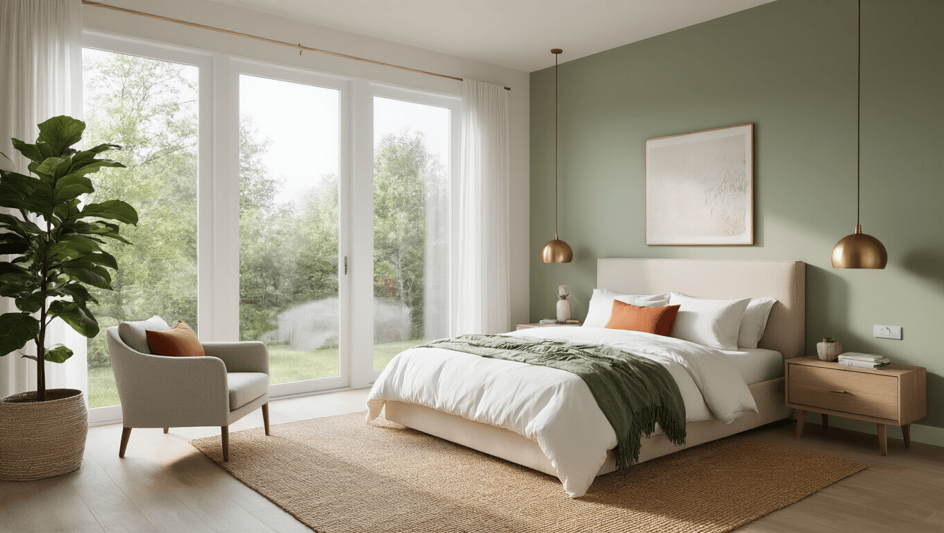
🌟 Steal This Look
- Paint Color: Benjamin Moore White Dove OC-17
- Furniture: upholstered platform bed in natural linen, mid-century walnut nightstands
- Lighting: oversized linen drum pendant with brass hardware
- Materials: raw Belgian linen, unbleached cotton, light oak, hand-thrown ceramics
This is the palette I recommend most to anxious clients—it quiets the mind visually and gives you permission to breathe when the day ends.
👑 Get The Look
Psychological Impact of Colors
| Color | Mood | Best For |
|---|---|---|
| Blue | Calm | Relaxation, Sleep |
| Green | Rejuvenating | Stress Reduction |
| Yellow | Energetic | Morning Motivation |
| Gray | Neutral | Sophisticated Minimalism |
| Terracotta | Warm | Creating Intimate Atmosphere |
Pro Styling Secrets
Color Application Techniques
- Accent Walls: Bold color on one wall creates drama without overwhelming
- Texture Play: Mix matte and glossy finishes for depth
- Metallic Touches: Add shine with metallic trim or accessories
Lighting Considerations
Remember: Colors look different under various lighting conditions. Always:
- Test color swatches at different times of day
- Consider both natural and artificial light
- Use peel-and-stick samples before committing

🏠 Steal This Look
- Paint Color: Behr Black Mocha N490-7
- Furniture: low-profile platform bed with channel-tufted velvet headboard in charcoal gray
- Lighting: oversized linen drum pendant with brass hardware and dimmer compatibility
- Materials: matte plaster walls, brushed brass accents, chunky wool throws, and high-gloss lacquered nightstands
Your bedroom is where you shed the day’s armor, so these techniques aren’t about impressing guests—they’re about crafting a cocoon that actually helps you exhale when the door closes behind you.
Practical Color Combinations
Foolproof Pairings
- Earthy Elegance: Terracotta + Cream
- Coastal Calm: Sky Blue + Sandy Beige
- Modern Zen: Sage Green + Warm White

🏠 Steal This Look
- Paint Color: Valspar Terracotta Tile 2002-6B
- Furniture: low-profile platform bed in natural oak with woven rattan headboard
- Lighting: oversized linen drum pendant with brass hardware
- Materials: unglazed terracotta pottery, slubby Belgian linen, raw-edge walnut, handwoven jute
There’s something deeply restorative about waking up in a bedroom that feels like it exists outside of trend cycles—this pairing has anchored spaces from Moroccan riads to California bungalows for good reason.
Common Mistakes to Avoid
- Don’t choose colors based solely on trends
- Always sample colors in your specific room
- Consider your furniture and existing decor
- Think about the mood you want to create
Budget-Friendly Color Transformation Tips
- Use paint as your primary transformation tool
- Invest in quality paint with good coverage
- Start with smaller areas if you’re color-shy
- Use removable wallpaper for temporary changes
Final Thoughts
Your bedroom is your personal canvas. Don’t be afraid to experiment, but also trust your instincts. The perfect color is the one that makes you feel most like yourself.
Pro Tip: Many paint brands offer virtual color visualization tools. Use them to preview your color choices before painting!
Ready to transform your bedroom? Your perfect color palette is waiting to be discovered.