This post may contain affiliate links. Please see my disclosure policy for details.
Why Color Matters: Your Bedroom’s Emotional Landscape
Contents
Picking the right paint color isn’t just about looks – it’s about creating a mood, a feeling, a personal retreat that speaks directly to your soul.
Trending Bedroom Colors That’ll Make Your Space Sing
1. Serene Neutrals: The Ultimate Zen Zone
- Soft whites that whisper calm
- Creamy beiges that wrap you in comfort
- Light grays that scream sophisticated relaxation
2. Nature’s Palette: Bringing the Outdoors Inside
- Sage green: Your personal forest retreat
- Botanical tones: Like a deep breath of fresh air
- Earthy browns: Grounded and oh-so-warm

Pro Designer Secrets for Choosing Your Perfect Color
Mood Mapping: What Do You Really Want?
- Calm sanctuary? Think soft blues and gentle grays
- Energy boost? Bring in some chartreuse or butter yellow
- Dramatic statement? Navy or deep plum are your new best friends
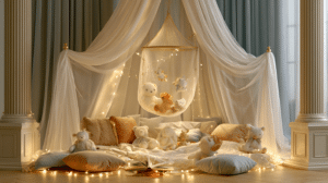
🏠 Steal This Look
- Paint Color: Sherwin-Williams Alabaster SW 7008
- Furniture: upholstered platform bed in natural linen, mid-century walnut nightstands with tapered legs
- Lighting: oversized linen drum pendant with brass hardware, dimmable for mood control
- Materials: raw Belgian linen, unbleached cotton, warm white oak, matte ceramic, hand-thrown pottery
Your bedroom is the only room where you start and end every single day—getting the color right here pays dividends in sleep quality and morning energy that no other space can match.
Color Confidence: Practical Painting Hacks
Before You Commit: Color Testing 101
- Grab those peel-and-stick samples
- Test in morning light, evening light
- Pro tip: Natural light is your ultimate color revealer
Finish Matters More Than You Think
- Matte finish = sophisticated and soft
- Eggshell = subtle sheen, easy to clean
- Avoid super glossy – this isn’t a disco ball!

✎ Steal This Look
- Paint Color: Benjamin Moore Chantilly Lace OC-65
- Furniture: Upholstered platform bed in performance linen, walnut floating nightstands with integrated charging
- Lighting: Adjustable wall-mounted swing arm sconces with linen shades on both sides of bed
- Materials: Raw Belgian linen, unbleached cotton canvas, matte blackened steel, white oak with limed finish
Your bedroom is where color psychology meets actual rest, so trust the process of slow observation rather than rushing to cover every wall before you’ve seen how morning coffee light hits that sample.
Top Paint Colors Interior Designers Are Loving Right Now
🎨 Neutrals to Die For:
- Benjamin Moore’s “Warm White”
- Sherwin-Williams “Neutral Ground”
🍃 Green Vibes:
- Farrow & Ball Calke Green
- Sherwin-Williams Willowleaf
🌊 Dreamy Blues:
- Farrow & Ball Pavilion Blue
- BEHR Ocean Abyss

Quick Styling Tricks
Small Room Magic
- Light colors = instant space expansion
- Dark colors = cozy intimate vibes
Accessorize Like a Pro
- White linens with bold walls = instant chic
- Metallic accents = modern touch
- Natural textures = warmth and depth

✎ Steal This Look
- Paint Color: Farrow & Ball Calke Green 34
- Furniture: vintage-inspired spindle bed frame in natural oak with woven rattan headboard
- Lighting: schoolhouse-style milk glass pendant with aged brass hardware
- Materials: unbleached Belgian linen, raw silk, weathered oak, hand-thrown ceramic, moss green velvet
There’s something deeply restorative about waking up surrounded by this particular green; it reads as nature without feeling like a greenhouse, and shifts beautifully from morning light through evening lamplight.
The Golden Rules of Bedroom Color Selection
- Test, Test, Test
- Consider Your Lighting
- Think About Your Emotional Response
- Don’t Fear Bold Choices
Your Color, Your Rules
Remember, these are guidelines, not gospel. Your bedroom should feel like YOU. Whether you’re a minimalist gray lover or a bold chartreuse warrior, own your color choice.
Pro Designer Insider Tip: Your bedroom is your personal sanctuary. If a color makes you feel good, it’s the right color. Period.

🖼 Steal This Look
- Paint Color: Behr Swiss Coffee 12
- Furniture: upholstered platform bed with channel tufting in performance velvet
- Lighting: brass arc floor lamp with linen drum shade
- Materials: raw linen, warm oak, brushed brass, hand-thrown ceramics
This is where you begin and end each day, so give yourself permission to break every rule if it means waking up in a space that genuinely feels like home.
🌊 Get The Look
Final Thoughts: Color is More Than Paint
Choosing a bedroom color is like choosing a mood, a lifestyle, a personal statement. It’s not just about what looks good – it’s about what feels right.
Go forth and color your world, design warriors! 🎨✨