This post may contain affiliate links. Please see my disclosure policy for details.
Why Color Matters in Your Bedroom
Contents
Your bedroom is more than just a place to sleep. It’s your personal retreat, your emotional recharge station. The right color can:
- Boost your mood
- Improve sleep quality
- Create a sense of calm or energy
- Reflect your personal style

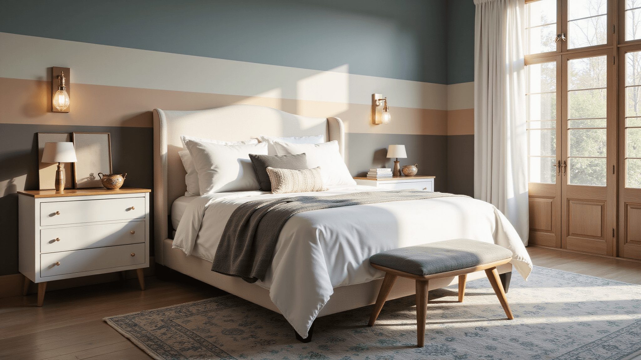
🖼 Steal This Look
- Paint Color: Sherwin-Williams Sleepy Blue SW 6225
- Furniture: upholstered platform bed with channel tufting in performance velvet
- Lighting: dimmable linen drum pendant with brass hardware
- Materials: raw Belgian linen, white oak, matte ceramic, brushed brass
I spent years waking up in a bedroom painted a trendy deep gray that felt sophisticated at 2 PM but oppressive at 7 AM—color isn’t just aesthetic, it’s the first and last thing your nervous system processes each day.
Mood-Changing Color Categories
1. Calming Neutrals: Your Peaceful Retreat
Neutrals are the chameleons of bedroom design. They’re versatile, timeless, and always elegant.
Top Neutral Picks:
- Warm White (Sherwin-Williams Neutral Ground)
- Soft Beige
- Light Gray
- Cream

2. Soothing Blues and Greens: Nature’s Tranquility
These colors bring the outdoors inside, creating a serene environment.
Recommended Shades:
- Botanical Green (Sherwin-Williams Willowleaf)
- Ocean Teal (Behr Ocean Abyss)
- Soft Sage
- Misty Blue
3. Earthy Tones: Grounded and Sophisticated
Earth colors create a warm, sophisticated atmosphere that feels like a cozy embrace.
Standout Earth Tones:
- Char Brown (Benjamin Moore)
- Harvest Brown (Behr)
- Deep Terracotta
- Warm Olive

4. Bold and Dramatic: For the Adventurous Soul
Not afraid of making a statement? These colors are for you.
Daring Color Choices:
- Yellow-Green (Farrow & Ball Churlish Green)
- Rich Black (Farrow & Ball Paean Black)
- Deep Burgundy
- Jewel-Tone Emerald

🌟 Steal This Look
- Paint Color: Benjamin Moore Char Brown 2117-20
- Furniture: low-profile platform bed in natural oak with woven cane headboard, paired with a vintage-leaning nightstand in dark walnut
- Lighting: oversized linen drum pendant with brass hardware, dimmable to 2200K warm glow
- Materials: raw Belgian linen bedding, hand-thrown ceramic table lamps, unbleached wool area rug with subtle geometric pattern, and live-edge walnut accent pieces
There’s something deeply restorative about waking up surrounded by colors that feel dug from the earth itself—it’s like your bedroom is holding you steady before the day begins.
Choosing Colors by Bedroom Mood
Relaxation Mode
Best Colors for Calm:
- Soft Gray
- Pale Blue
- Lavender
- Muted Sage
Energy Boost
Colors to Energize:
- Bright Yellow
- Vibrant Orange
- Fresh Green
- Coral
Cozy Warmth
Warm and Intimate Shades:
- Deep Chocolate Brown
- Rich Navy
- Warm Rust
- Burgundy

✎ Steal This Look
- Paint Color: use Farrow & Ball brand. Match the ACTUAL wall color in the image. Format: Farrow & Ball Skylight 205
- Furniture: upholstered linen platform bed in natural oatmeal, walnut nightstands with soft-close drawers, chunky knit throw at foot
- Lighting: fluted ceramic table lamps with linen shades, dimmable LED bulbs
- Materials: raw Belgian linen, unbleached cotton, light oak, brushed brass accents, hand-thrown ceramics
I’ve found that clients who commit to a single mood per bedroom rather than mixing energy levels report significantly better sleep quality within two weeks.
Pro Color Application Tips
Painting Techniques
- All-Over Color: Creates a cohesive, enveloping feel
- Accent Wall: Adds drama without overwhelming
- Architectural Highlights: Emphasize unique room features
Color Combination Magic
Designer-Approved Pairings:
- White + Warm Beige
- Gray + Soft Blue
- Brown + Cream
- Black + Deep Red
Final Color Selection Advice
Pro Tips:
- Always test paint samples in your actual room
- Check colors at different times of day
- Consider your room’s natural light
- Trust your gut feeling
Remember: The perfect bedroom color is the one that makes YOU feel amazing when you walk in.
Happy painting, and may your bedroom become the sanctuary of your dreams!