
This post may contain affiliate links. Please see my disclosure policy for details.
Why Pink Gets a Bad Rap (And Why You Should Ignore It)
Contents
- Why Pink Gets a Bad Rap (And Why You Should Ignore It)
- The Pink Shades That Transform Bedrooms
- Pink and White: The Classic That Never Disappoints
- Pink and Grey: Modern Sophistication
- Pink and Navy: Drama Without the Darkness
- Pink and Green: Fresher Than You’d Think
- The Power of Pink Wallpaper
- Textures That Make Pink Bedrooms Feel Expensive
Pink suffers from an image problem.
Too many people think pink equals childish, overly feminine, or outdated. That’s complete nonsense.
Dusty rose throw pillows create warmth that grey never could. Blush walls make a room feel wrapped in soft light. Coral energizes without the aggression of red.
The problem isn’t pink—it’s bad pink execution.
The Pink Shades That Transform Bedrooms
Not all pinks are created equal.
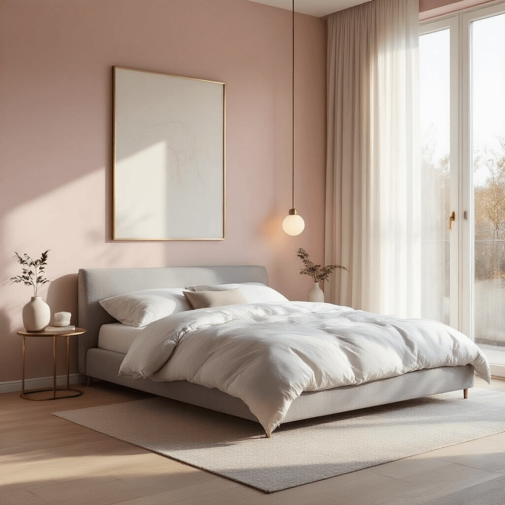
Blush Pink creates sophistication and calm. This is your safe bet if you’re pink-nervous. It reads almost neutral in certain lighting and pairs beautifully with everything from navy to gold.
Dusty Rose brings vintage elegance without the granny vibes. This muted, greyish-pink works in modern spaces and traditional rooms alike.
Coral Pink adds energy and warmth. If your room lacks natural light, coral reflects brightness better than pastel pink.
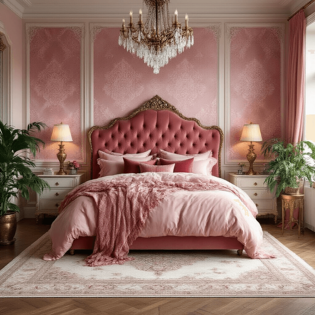
Hot Pink makes a statement. Use it sparingly—an accent wall, velvet accent chair, or bold artwork.
Pale Pink whispers rather than shouts. Perfect for ceilings (yes, ceilings!) to add subtle interest overhead.
I painted my bedroom in Farrow & Ball’s Pink Ground three years ago. Half my guests don’t even register it as pink—they just say the room feels “soft” and “expensive.” That’s the power of choosing the right shade.
Pink and White: The Classic That Never Disappoints
This combination feels fresh, clean, and timeless.
Here’s how to make it work:
- Use white as your dominant color (60-70% of the room)
- Add pink through bedding, curtains, or an accent wall
- Layer textures—white linen duvet covers with pink velvet pillows
- Introduce natural wood tones to prevent the room from feeling too sterile
The mistake everyone makes: Using the exact same shade of pink throughout. Mix your pinks. A blush wall with dusty rose curtains and coral accessories creates depth that monochrome pink never will.
Add white furniture with natural wood legs, not stark white everything. Throw in cream-colored area rugs instead of pure white to soften the contrast.
Pink and Grey: Modern Sophistication
Pink and grey creates the grown-up bedroom aesthetic you’re actually going for. The grey grounds the pink, preventing any “princess bedroom” associations.
My recommended approach:
- Paint three walls in soft grey
- Make one wall your pink accent (behind the bed works best)
- Choose bedding that incorporates both colors
- Add brass or gold hardware and lighting fixtures
Grey works as the workhorse color while pink provides the personality.
I added a grey upholstered headboard to my client Sarah’s bedroom last year, paired with blush walls and charcoal curtains. She texts me photos of it approximately once a month with heart emojis.
Pro tip: Use different grey tones—not just one flat grey. A pewter lamp base, dove grey sheets, and charcoal curtains create layers that make the room feel intentional rather than matchy-matchy.
This combination surprises people every time. Navy provides contrast and depth while pink softens the potential severity.
The formula that works:
- Navy walls (yes, really)
- Pink bedding and window treatments
- Gold or brass accents to tie everything together
- White trim and doors for crisp definition
The navy makes the pink pop without overwhelming it.
I was skeptical until I saw this combination in my friend Marcus’s bedroom. His navy walls with blush bedding and brass table lamps look masculine, elegant, and completely unexpected.
Alternative approach: Pink walls with navy accents through furniture and textiles if full navy walls feel too bold. A navy velvet bench at the foot of a bed with pink walls creates a stunning focal point.
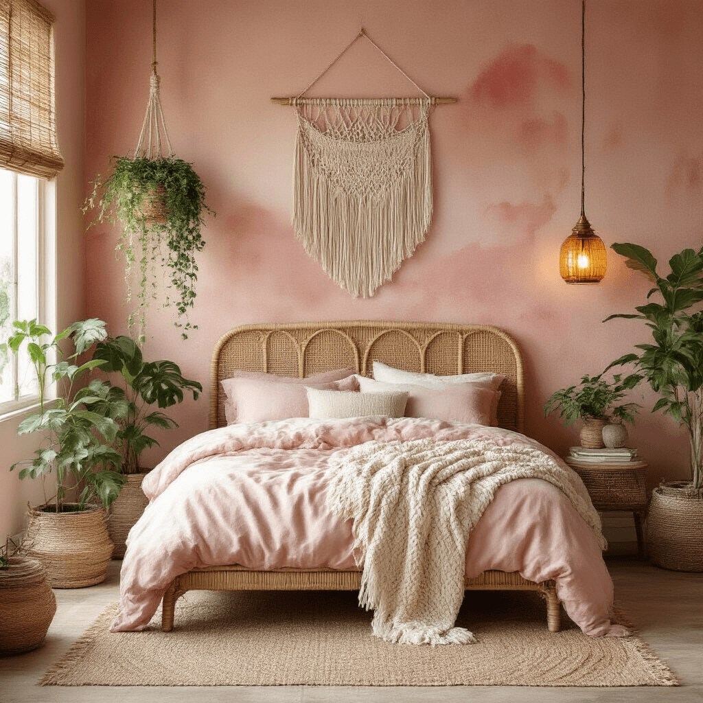
Pink and Green: Fresher Than You’d Think
This combination channels garden vibes without the country cottage clichés.
Color pairings that work:
- Blush pink with sage green
- Coral with emerald green
- Dusty rose with olive green
The green provides organic freshness that balances pink’s warmth.
Implementation ideas:
- Pink walls with large green plants (real or incredibly convincing faux)
- Green accent wall with pink bedding
- Pink and green botanical prints that incorporate both colors
Add natural materials—rattan, jute, bamboo—to reinforce the organic feel. Avoid overly bright, artificial-looking greens that clash rather than complement.
My sister combined terracotta pink walls with multiple large plants in her bedroom. The green from the plants provides all the color contrast she needs without painting another wall.
The Power of Pink Wallpaper
Wallpaper lets you introduce pink without the commitment of painting four walls.
Approaches that work:
- Subtle patterns: Small-scale florals or geometrics in blush tones create texture without overwhelming
- Bold statements: One accent wall in vibrant pink wallpaper with remaining walls in neutral tones
- Textured options: Grasscloth or linen-textured wallpaper in pink adds depth through dimension
I installed a pink damask wallpaper behind my client Jennifer’s bed. The pattern catches light differently throughout the day, making the room feel dynamic rather than static.
The wallpaper rule: If your wallpaper is patterned, keep your bedding simple and solid-colored. Too many patterns compete rather than complement.
Textures That Make Pink Bedrooms Feel Expensive
Texture transforms pink from flat to phenomenal.
Layer these textures:
- Velvet throw pillows in varying pink shades
- Linen curtains that diffuse light softly
- Knitted or chunky woven throws


