This post may contain affiliate links. Please see my disclosure policy for details.
Why Dark Green Makes Your Design Choices More Critical
Contents
Dark green isn’t your typical neutral backdrop. This color carries weight, literally and visually. It absorbs light, creates mood, and demands complementary colors that either soften its intensity or amplify its drama.
I learned this the hard way when I paired my beautiful forest green accent wall with bright purple throw pillows. The result? My guests asked if I was feeling okay. The lesson? Understanding color relationships isn’t just design theory—it’s the difference between a space that feels intentional and one that feels like a mistake.

The Foolproof Neutrals That Never Fail With Dark Green
Warm Neutrals: Your Safe Haven
When I first started working with dark green, warm neutrals became my security blanket, and for good reason. Beige, cream, and chocolate brown share dark green’s earthy DNA. These colors create natural harmony because they exist together in nature—think forest floors, tree bark, and autumn leaves.
In my kitchen, I paired dark green cabinets with cream-colored countertops, and the combination instantly felt warm and inviting rather than heavy.
Here’s what warm neutrals do for dark green:
- Balance the visual weight without competing for attention
- Add warmth that prevents spaces from feeling cold or institutional
- Create timeless combinations that won’t look dated in five years
- Work in literally every room without exception
My bathroom features dark green subway tiles with chocolate brown towels and beige grout, and it’s the most compliment-generating room in my house.
Wood Tones: Nature’s Perfect Partnership
Wood and dark green together feel like coming home. I’ve used everything from light pine to deep walnut with various shades of dark green, and I’ve never encountered a combination that didn’t work.
The magic happens because:
- Both materials connect to natural, organic environments
- Wood’s warmth counteracts any coldness in darker greens
- The pairing works across every design style from rustic to contemporary
- You can layer different wood tones without creating visual chaos
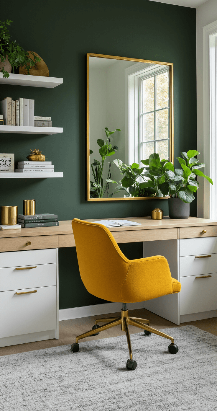
In my home office, I positioned my dark green wall behind a light oak desk, and the contrast makes both elements pop without fighting each other.

Gray: The Sophisticated Mediator
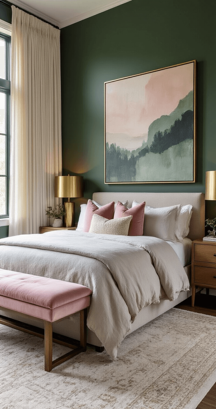
Gray became my secret weapon for keeping dark green spaces feeling light and modern. This neutral adds sophistication while providing visual breathing room. I painted my bedroom ceiling a soft gray with dark green walls, and the room immediately felt taller and less enclosed.
Gray works brilliantly because it:
- Provides contrast without drama
- Keeps spaces feeling contemporary and fresh
- Reflects more light than darker colors
- Bridges the gap between dark green and brighter accent colors
My favorite combination? Dark green walls with gray linen curtains that soften the intensity while maintaining elegance.
White: The Ultimate Balancer
White is dark green’s best friend for one simple reason: contrast. When I added white trim, ceiling, and built-in shelving to my dark green living room, the space transformed from cave-like to cozy.
White serves multiple purposes:
- Makes ceilings appear higher
- Reflects light into darker spaces
- Creates clean, crisp edges that define spaces
- Prevents dark green from overwhelming small rooms
I recommend going with crisp, bright white rather than cream when you want maximum contrast and modern appeal.
Black: For the Boldly Sophisticated
Black intensifies dark green’s inherent drama. I added black hardware to my dark green kitchen cabinets, and the combination screams luxury. But here’s the catch: black and dark green together need light to balance them, or you’ll create a space that feels oppressive.
I learned this when I painted my windowless powder room dark green with black fixtures. It looked incredible in photos but felt like a dungeon in person. The fix? I added a large brass-framed mirror and doubled the lighting, and suddenly the drama worked.
Jewel Tones That Amplify Dark Green’s Luxury Factor
Burgundy and Maroon: Rich, Moody, and Intentional
These deep reds create spaces that feel like expensive libraries or boutique hotels. I used burgundy velvet pillows on my dark green sofa, and guests literally asked where they could buy the same combination.
The key to this pairing:
- Use burgundy sparingly as an accent, not a dominant color
- Balance with lighter neutrals to prevent visual heaviness
- Consider the room’s natural light before committing
- This works best in spaces meant for evening use
Too much of this combination in a north-facing room made my dining area feel like a cave until I added cream accents and better lighting.
Gold: Instant Glamour
Gold hardware against dark green cabinetry changed my entire kitchen’s personality. What was traditional suddenly felt glamorous and expensive.
Gold works with dark green because:
- The warm metallic complements green’s natural undertones
- It adds light without using actual color
- The combination feels both classic and contemporary
- Small amounts make a huge impact
I replaced all my brushed nickel hardware with gold cabinet pulls, and the transformation cost under $200 but looked like a complete renovation.
Navy and dark green together create surprising harmony. I was skeptical until I tried navy throw blankets on my green sofa. The combination works because both colors share depth and sophistication without competing for dominance. This pairing shines in traditional spaces but works equally well in modern designs when balanced with lighter elements.
Bold Accent Colors That Bring Dark Green to Life
Mustard Yellow: Complementary Color Magic
Mustard yellow sits opposite dark green on the color wheel, making them natural partners. This combination brings warmth and energy without feeling childish or overly bright.
I added mustard yellow throw pillows to my dark green reading chair, and the corner went from ignored to everyone’s favorite spot.
Why this works so beautifully:
- Complementary colors create visual interest naturally
- Mustard’s warmth counteracts any coolness in dark green
- The combination feels both retro and contemporary
- It works in small doses or as a dominant accent
Start with small accessories if you’re